I’ve been working recently with a fresh batch of Detroit Fire Incident data from Detroit’s Open Data Portal, which has led to submitting an entry in the Visualizing Detroit: The Art of Data exhibition. We’ll see what happens with the submission, but accepted or not, here’s some background on the project.
Overview
The project starts with the data, followed by some calculations and modifications in Exploratory, before making it’s way to Mapbox for mapping, and to Cosmograph for building network graphs. We then use our Mapbox and Cosmograph outputs to create graphics for a final presentation.
Here’s an example of a summary of 2017-2025 data for Engine 54, a station covering the far Northwest side of Detroit:
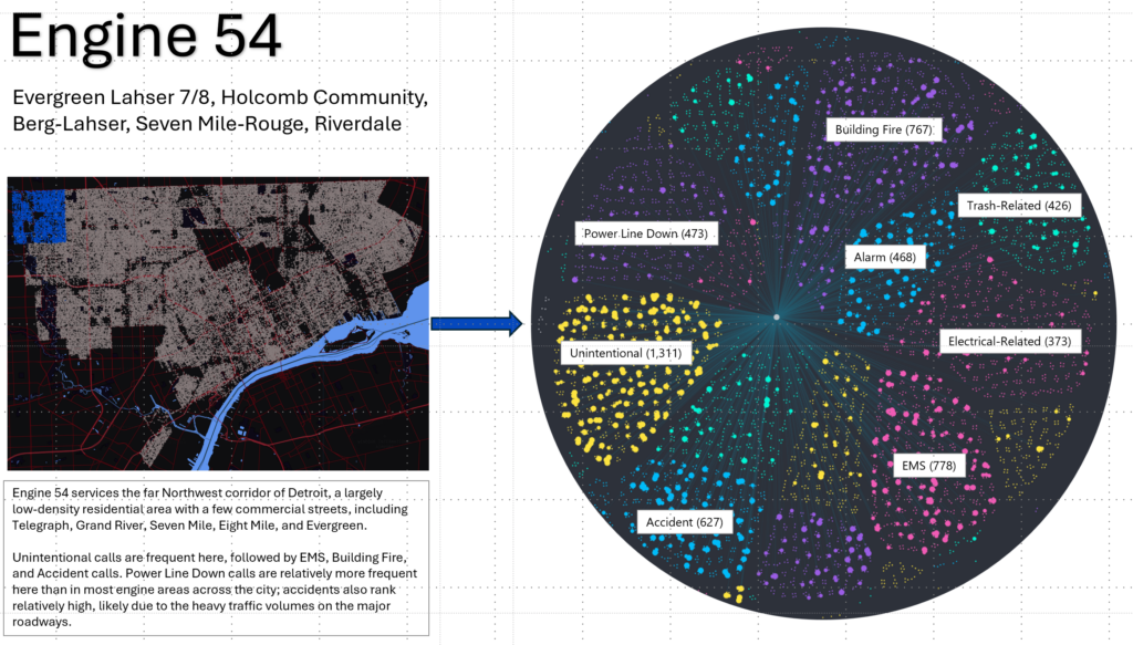
We can see the Mapbox component represented in the left image, with each of Engine 54’s calls shown in blue; the rest of the city is in gray. This provides geographic context for the data, which is critical when we use multiple engine areas for the exhibit.
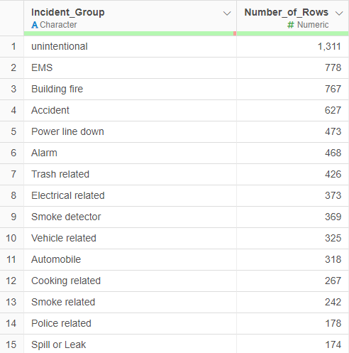
The circular image is a screen clip of the types of calls most prevalent in Engine 54’s area, overlaid with call volumes. The node in the center of the graph represents Engine 54. We use edges radiating out from the central node to connect each node in the graph, colored by incident types. Larger call nodes indicate more than one call tied to an address (based on lat-lon codes in the data). I have labeled the most frequent call types (using Exploratory) for the Engine 54 area:
What’s Next?
This has been a simple overview of how the displays are created. In upcoming posts, I’ll dig deeper into both the Mapbox and Cosmograph processes. As always, thanks for reading!