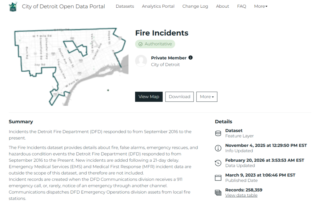
The highly detailed Detroit Fire Incidents data set is available at the Detroit Open Data Portal. A key aspect of the data lies in its lat-lon geographic coordinates, making it a perfect candidate for network analysis using the Cosmograph platform. This post will walk through examples of how Cosmograph can be used to highlight the underlying information in a dataset.
What are Network Graphs? And Why Should We Use Them?
Network graphs are a powerful visualization type for cases with connected data points. In simple terms, networks are composed of nodes (points) and edges (connections). Users can employ network graphs to analyze patterns in connected data that might be difficult to detect using other analysis methods. One of the strengths of network graphs is their highly visual output, ideal for pattern detection.
The fire incidents data provides an interesting case, as the only connections are between the individual stations (Engine Area) and the various calls they receive (incident types/groups). This will result in graphs with the station at the center, surrounded by the thousands of calls received within our timeframe. We’ll see the results shortly.
The Data
The initial process will be very similar to what I shared in my previous post on mapping the data with Mapbox. Our data journey begins by downloading the Detroit Fire Incidents data from the City of Detroit Open Data Portal. This is a large dataset covering the period from late 2016 to the present. We’ll reduce the data to the 2017-2025 period in Exploratory after the download.
Processing the Data
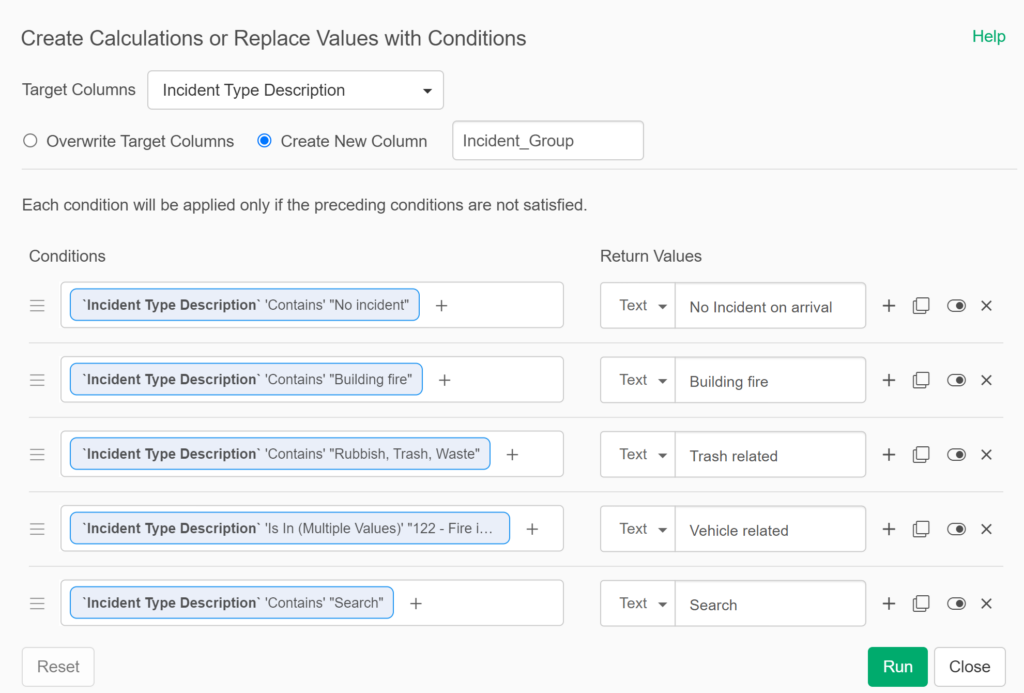
Our downloaded dataset is ready for Exploratory, where I’ll create a series of calculations to enhance the existing data. Many of these will involve time elements, so that we can better understand how long calls take from the original call time to dispatch, arrival, and ultimately to when the unit leaves the scene. These calculations will make their way into future posts. For our initial purposes, I have grouped incident types into groups, making it easier to analyze and display. Here are a few examples:
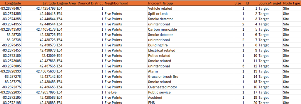
After some further data cleansing, I can then export the data points for network analysis. Here’s a small subset of what this file looks like:

There is one essential difference compared to our Mapbox analysis: lat-lon data is of secondary importance for Cosmograph, used for counting the number of calls to a specific address. However, the Engine Area and Incident_Group values are essential. We can get more granular by using the Neighborhood data element, but we’ll stick with Engine Area for now. This will enable the coordination of network graphs produced by Cosmograph with the maps created in Mapbox.
Exporting the Data for Network Analysis
There is one significant difference with our Cosmograph input files – they require source and target value nodes to build a graph. The sources in this case will be all the fire stations, as defined by the Engine Area value. The targets will be every instance of a call to a specific address, coupled with the incident group information. We could certainly factor in other data elements (especially time & date data), but we’re keeping it simple for this analysis.
We again use Exploratory to create the source and target nodes. To do this, we split the Engine Area lat-lon data from the call location lat-lon info; the Engine Area data becomes the source nodes, and everything else is a target node. We can then merge the two branches to create output files containing both source and target values. Here are examples of the final output. First, the nodes file:
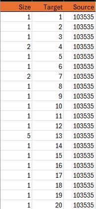
Note that the nodes file will contain most of the information to be used in creating a graph – clustering, labeling, coloring, and sizing all come from the nodes file. Next up is the edges file, which provides the source and target information for Cosmograph to draw the graphs:
Edge files are typically simple; all that’s required are the source and target values, but this is essential to creating the network graph connections. Next, let’s have a look at the import process.
Importing Files to Cosmograph
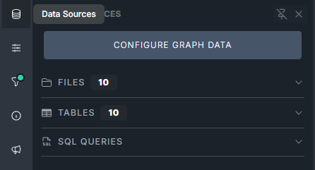
We begin the import process by clicking the data source icon on the left sidebar menu in Cosmograph:
The next step is to select the Add files button – you can see some existing files I previously imported in this screenshot
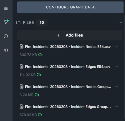
After importing our required node and edge files, we move to the next step – configuring the graph.
Configuring the Graph
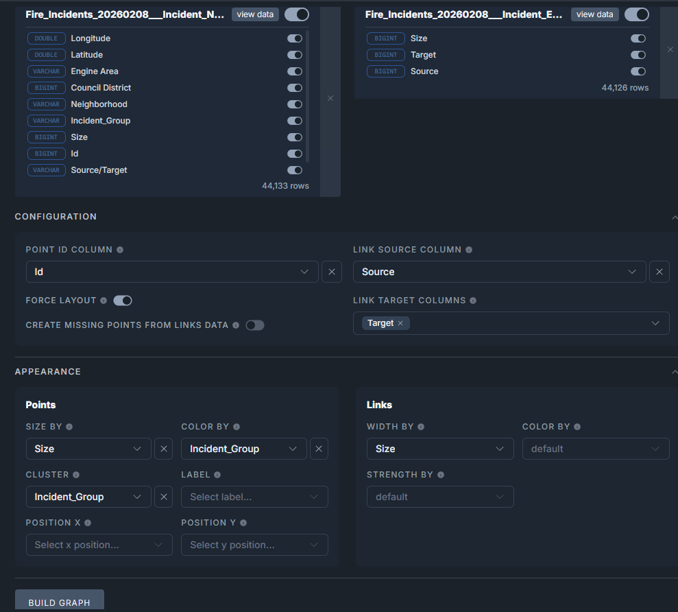
This is where we set the parameters Cosmograph will use to build each graph. We provide both a nodes source file (left side below) and an edges source file (right side). We can then define the data fields used to size, cluster, and color the graph. Once everything is set, we click the Build Graph button to start the creation process.
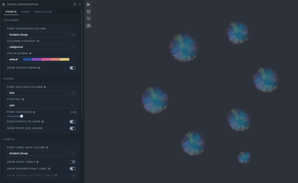
After we click the Build Graph button, we sit back and let Cosmograph do its work. Once it completes the graph process, we have a result similar to this:
Understanding the Graph
Wow – seven different networks – what’s going on? Recall that we used four sets of inputs, each with a node file and an edge file. These files contained either six or seven engine areas, just as our Mapbox source files did. So what we’re seeing above are the seven engine areas in one node/edge pair. There are some positives to be gained by this approach; first, we can easily zoom into any one of the networks, and second, the networks are all constructed the same way, based on our configuration specifications. They all employ the same clusters, same colors, and same sizing logic. To learn more about a single network, we simply zoom in. Here’s a zoomed view of one engine area network:
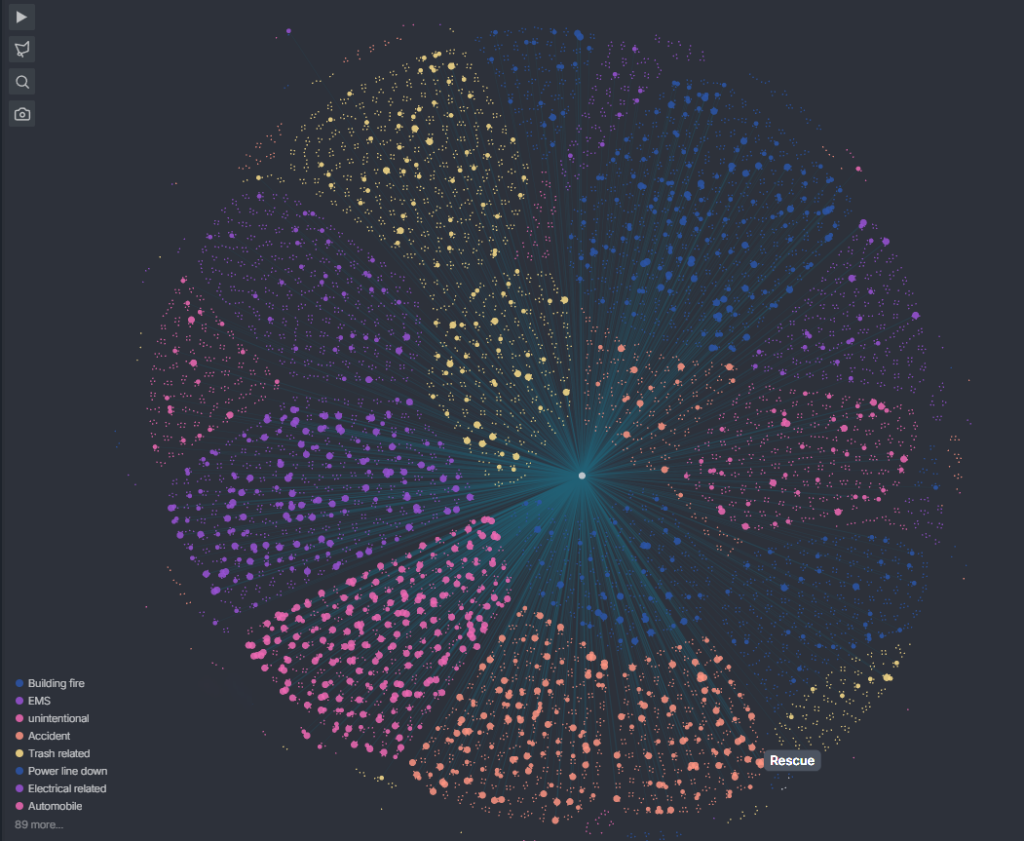
Note how each incident group composes distinct sections of the graph; all Building Fires are grouped in one area, all EMS calls are grouped in another area, and so on. Recall that we directed Cosmograph to cluster and color the graph based on the Incident_Group data. This makes it easy to do some quick visual assessments to determine the relative frequencies of each call type. Clicking on specific incident groups in the legend filters the graph and provides data details (for all seven graphs) in the sidebar:
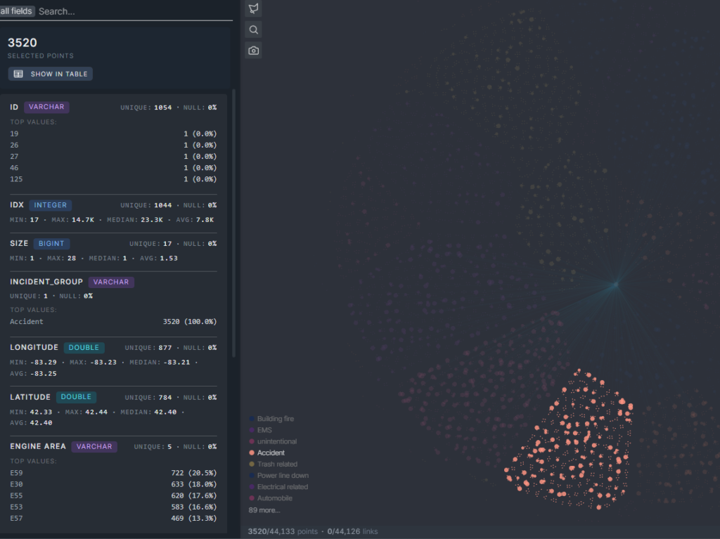
Now we can see the Accident group, with all remaining data muted. If we choose to zoom out, we would see Accident data highlighted for each of the seven graphs. Kind of fun, right? Imagine the possibilities for investigating each network, or specific incident groups, and so on. We’re going to stop here, but I think you get the idea of how network graph analysis can be used to better understand complex datasets.
Summary
This was a high-level overview of preparing and analyzing data for a network graph context. We really just scratched the surface of what can be done using this approach, but I hope you found it informative. As always, thanks for reading!