The highly detailed Detroit Fire Incidents data set is available at the Detroit Open Data Portal. A key aspect of the data lies in its lat-lon geographic coordinates, making it a perfect candidate for mapping in a tool like Mapbox. This post will walk through examples of how Mapbox can be used to highlight the underlying information in a dataset.
The Data
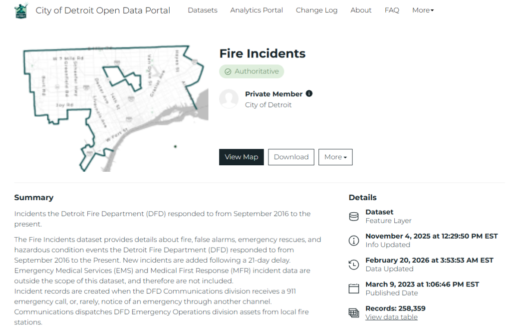
Our data journey begins by downloading the Detroit Fire Incidents data from the City of Detroit Open Data Portal. This is a large dataset covering the period from late 2016 to the present. We’ll reduce the data to the 2017-2025 period in Exploratory after the download.
Data Processing and Exporting
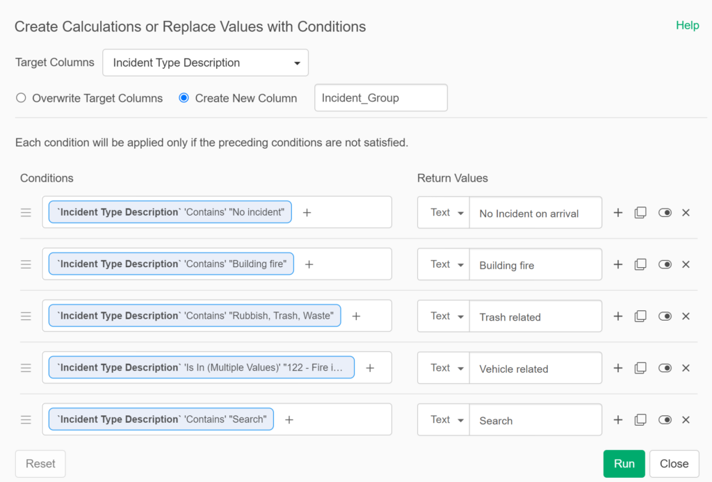
Our downloaded dataset is ready for Exploratory, where I’ll create a series of calculations to enhance the existing data. Many of these will involve time elements, so that we can better understand how long calls take from the original call time to dispatch, arrival, and ultimately to when the unit leaves the scene. These calculations will make their way into future posts. For our initial purposes, I have grouped incident types into groups, making it easier to analyze and display. Here are a few examples:
After some further data cleansing, I can then export the data points for mapping. Here’s a small subset of what this file looks like:

Note that we created four export files based on Engine Area filters; Mapbox wants .csv imports to be < 5 megabytes, so I split the data. The resulting files are each roughly 2 megabytes (I removed many unnecessary data fields), so we’re good to go.
Importing to Mapbox
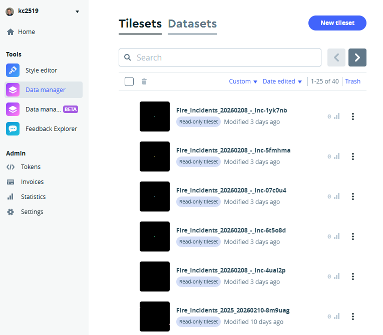
In our example, the imported data sets are in the previously created .csv files; Mapbox also accepts files in GeoJSON, GPX, Shapefile, and KML formats. The import process can be initiated by selecting the New tileset button from the Tilesets tab in Mapbox. A few of my previously imported files are shown below:
Detroit Fire Incidents Tilesets & Styles
After importing the files and creating the tilesets (a single process), we wind up with four layers in Mapbox, based on the previously noted engine areas. With 27 such areas, three of our files have seven areas each, and the fourth has the remaining six. We will be able to style and display these individually or collectively in Mapbox.
We can think of a tileset as the file containing all the information to be displayed on a map. This can encompass many elements, from lat-lon location data, to descriptive fields, categorical data, timestamps, and many other attributes. The other key component in Mapbox is Styles, where we become artists creating a visual canvas for displaying our data. Mapbox gives us nearly endless options for styling backgrounds, roads, buildings, land, water, and of course, our uploaded data elements.
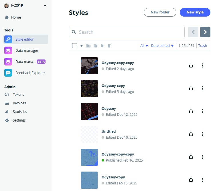
Here is a sampler of some styles I have created previously:
It’s important to note that a single style may host many tilesets (typically as layers in a single folder); we can then elect to display one or more of these layers while hiding others. Let’s now take a quick look at how I chose to display some elements in the fire incidents data.
Customizing the Detroit Fire Incidents Display Elements
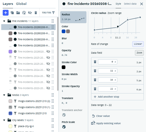
When we work with lat-lon (point) data, sizing the points is critical to an effective display. Since the fire incidents data contains thousands of data points, it is useful to explore different strategies for the Mapbox Radius element. I ultimately chose to scale the points based on the zoom level; the more a user zooms in, the larger the circles become:
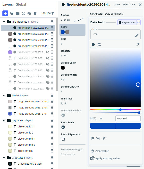
Next, we move on to choosing colors for the circles; for this exercise, I want to see just one or two engine areas highlighted. We can execute this strategy through the use of a data condition. We set the default (fallback) color to a shade of gray, and then tell Mapbox to use a vivid blue for Engine Area = E58. FYI, I followed the same process in another layer for Engine Area = E54.
Here’s the result of applying the sizing and color strategies:
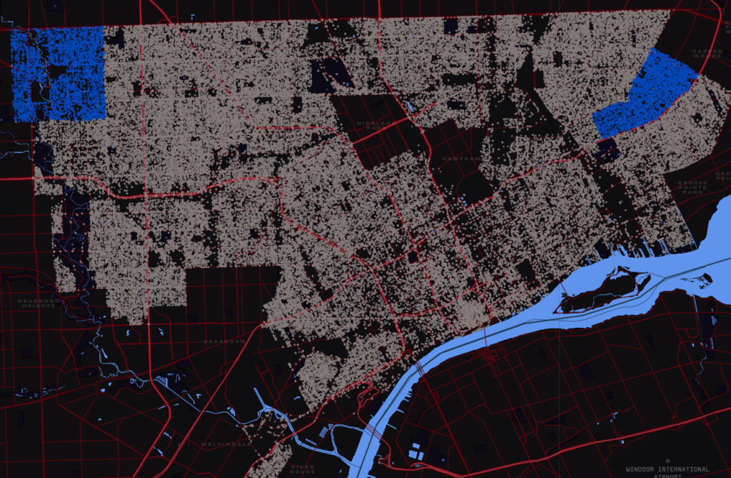
It’s now very easy to see the coverage areas for engine areas 54 & 58.
Summary
This is a very high-level view of my process; there are many more options available in Mapbox. We could choose to color the circles based on the incident group, or import the timestamp data and examine differences by engine area, incident group, time of day, day of the week, or even by month or year. I hope to follow this up with additional analyses using this rich dataset. As always, thanks for reading!