In the last two posts, I started exploring the geographic component of Detroit Land Bank sales using Exploratory as my analytic tool. We’ve now exported the data to Carto, where some additional mapping can be done, helping us to dive into the patterns behind the data. First up is a torque map, showing all property sales over time, building to a cumulative heatmap as more data points are added. Here’s an intermediate view somewhere around early 2017:
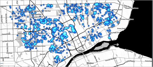
I’ve overlaid this map on a Stamen Toner background map which facilitates viewing major streets and freeways in the city. This is a useful approach to help orient viewers without getting too deep into the details. Here’s the interactive version of this map:
Another view using Carto would be to filter for the most expensive properties and see where in the city they are located. Recall in a prior post that the Davison and Claytown neighborhoods stood out by average sale price, largely due to a handful of properties selling in excess of $10,000 against a sub-$2,000 city-wide average. In the map below, we are looking at all the properties selling for more than $5,000. Take note of how many properties are clustered in the two neighborhoods, and especially in the Davison area. There has been a lot of activity in what has been a rather down and out part of our city. Zoom in to see the clusters split into individual properties; this will help provide a sense for activity along individual streets.
We’ll examine one more map in this post in an attempt to shed light on purchase patterns over time. This will require a category map colored by purchase period. Combined with the prior maps, this should help provide a sense for which areas have shown recent activity versus others that may have been hotter a few years earlier. The data will tell the story as long as we construct the map carefully. In this case we’re using blues and purples for the early sales years, and oranges and reds for 2018-2020 to help identify time patterns. Note the prevalence of dark red, indicative of the ramp-up in sales volume in 2020. Remember to zoom in to gain further clarity on the patterns.
That’s it for now; thanks for reading and I hope you gained some insights into the patterns within the land bank data.