One of the more aggressive attempts to revitalize many Detroit neighborhoods has come in the form of the Detroit Land Bank Authority. This program allows residents to bid on city-owned properties, many of which have fallen into disrepair. The program has its detractors, but has managed to return thousands of properties to individual owners, where they at least have the potential to become vital assets once more. In this post, we’re going to walk through some of the numbers associated with the program in an effort to understand trends and patterns. Among the questions we’ll seek to answer are these:
- How many properties have been sold, and how much revenue has been generated?
- Is sales activity flat, increasing, or decreasing over time?
- Are sales prices showing any sort of trend?
- Which neighborhoods are seeing the greatest activity?
- Are there other noteworthy patterns?
Our data, as it so often does, comes from the city’s open data portal at https://data.detroitmi.gov/. This data will enable us to create some interesting charts and other visuals that detail the patterns for this program. Once again we will utilize Exploratory to detail our visual journey into the data.
First, a little background – our data set covers transactions through 10/5/2020, spanning six years of activity. The data includes detail down to the specific address of each property as well as useful details such as council district, neighborhood name, and of course the date and sales amount for every property. This detail will enable us to walk through multiple posts where we learn a great deal about the program. With the background out of the way, let’s begin our journey.
The Overall Numbers
Our first step is to understand the basic counting statistics the program has generated – how many properties, how much revenue, and the average price for each property. Here’s our first number courtesy of Exploratory:
5,498 Sales
Over the course of roughly six years, the Land Bank program has sold well over 5,000 properties. This seems like a solid number, as it reflects close to 1,000 sales per year of previously dormant properties. The next question is obvious – how much revenue has been generated through these property sales? Here’s our answer:
$10,702,695 Total Revenue
To date, the program has sales revenue closing in on $11 million. Again, this sounds like a nice number; the city gets revenue from previously unused properties, the properties are repaired and maintained by new owners, and neighborhoods have fewer vacant properties, so it seems like a win-win-win scenario. Next, we’ll have exploratory calculate the average sale price for us:
$1,947 Average Sale Price
With an average sales price of less than $2,000, the program is providing opportunities for individuals to acquire properties without a significant cash outlay. Since many of these properties require major work after purchase, it is encouraging that a minimal investment can get a property started down the road to rehabilitation. This is clearly not just a program for outside investors, but something where neighbors and other residents have the ability to acquire properties at entry-level prices.
Land Bank Trends
With the basic counting statistics covered we can begin to move into greater detail to see if the program is moving in the right direction by examining a series of charts generated in Exploratory. Our first chart looks at the trend in both the number of properties as well as the average price of a property, aggregated by quarter:
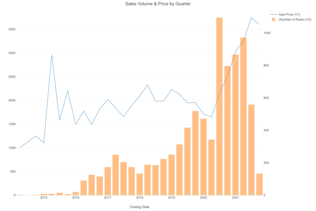
We can see from the chart that the program had a slow start, with very few properties being sold through 2015. The volumes began to accelerate in 2016, and have gradually increased before really taking off in Q3 2020 (July-September). Average prices, meanwhile, have generally remained in a narrow band between $1,500 and $2,300 each quarter. They show a large increase in October, but we are looking at a very small number of sales, so this probably does not indicate a trend of any sort.
Now that we have seen the summary trends across the city, let’s dive in to the council district level. With just seven districts, we’ll use a small multiples set of charts to view the same patterns at a deeper level:
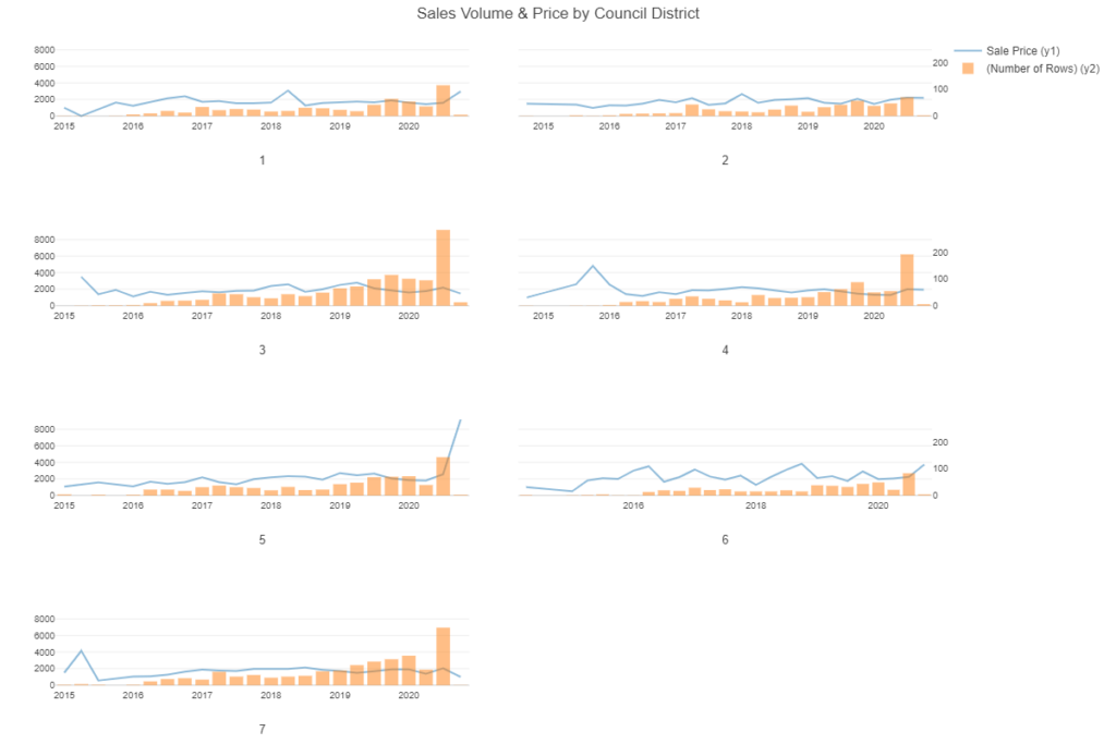
These charts help shed some light on the huge volume increase we saw for Q3 2020. When we view the individual districts, we can see that much of the increase came from districts 3, 4, and 7, although all districts saw an increase in activity.We can’t explain the reasons for this surge, but we can identify where it was most acute. We can also see the early October price increase coming from district 5; perhaps the properties sold there were not typical of normal land bank sales.
Geographic Patterns
We now have a bit more insight into where the increased volumes are coming from, but most viewers will not be completely familiar with council boundaries, making the information less informative than we might hope. To gain deeper insights we can start using some maps, specifically heatmaps to highlight hotspots for both volume and price levels. Let’s begin with a sales volume view, where red colors are indicative of the hottest sales areas:
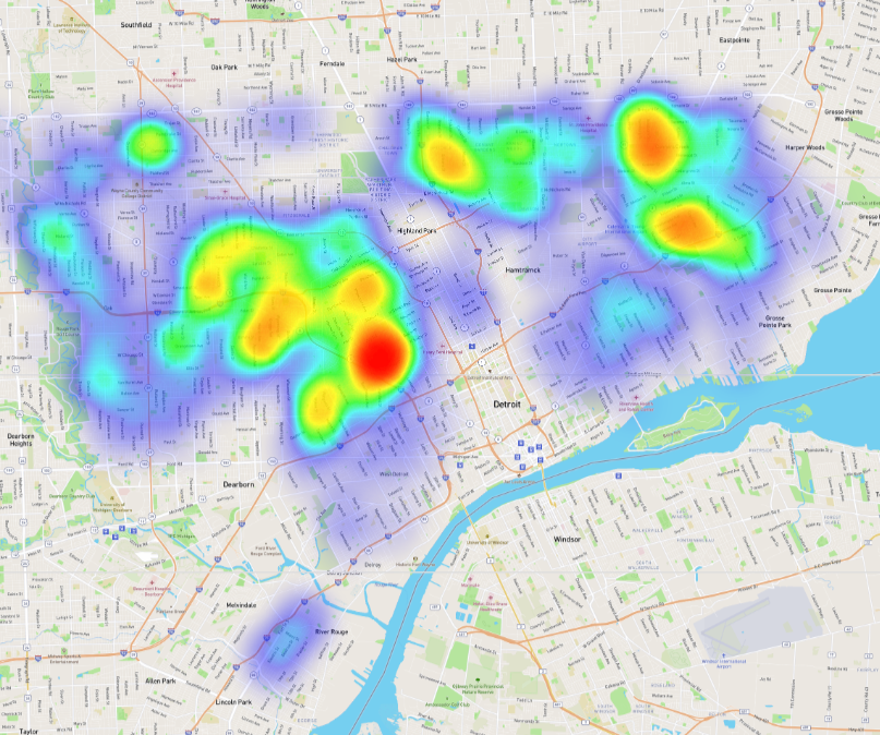
A few areas stand out when looking at the volume of sold properties – most notably, the area to the immediate northwest of downtown traversing the I-96 freeway. We see some additional hotspots to the far northeast, near the Grosse Pointe Park, Harper Woods, and Eastpointe borders, plus some other scattered spots both northwest and due north of downtown.
We now understand where we are likely to find the most sold properties, yet we know nothing about sale prices at this same level. To rectify that we can use an identical heatmap except with average sales price dictating the colors:
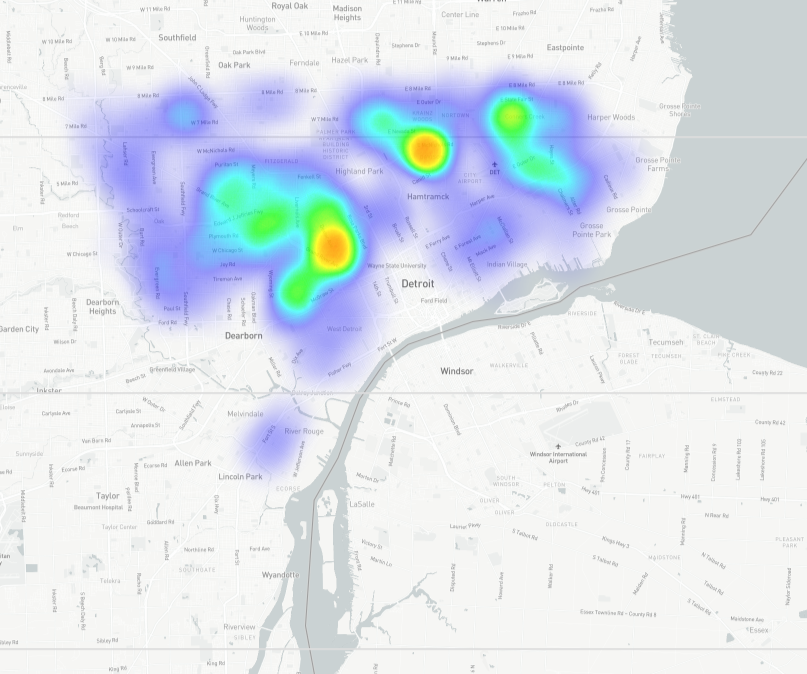
Color changes here are less dramatic, telling us that price levels are more consistent across the city compared to sales volumes. We do continue to see a couple spots with higher average prices, including the same area northwest of downtown where we saw high sales volumes. This is an area worth investigating further.
We have successfully overlaid both volume and price information on a map of the city, giving us far greater insight than we had before starting this journey. Now it’s time to return to some charts that will categorize this data at the neighborhood level, making it relevant for individuals within neighborhood clusters around the city. We don’t have the ability to show neighborhood boundaries using this data set, so a bar chart will be our next best option. Here’s a look at the Top 20 neighborhoods by sales volume, and their average sales price:
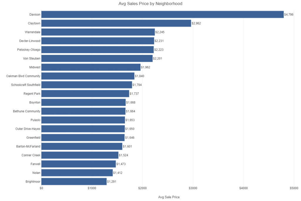
Two neighborhoods really stand out as different from the others shown in the graph. The Davison neighborhood has an average sale price close to $5,000 versus our composite average of $1,947 shown earlier. The Claytown neighborhood also far exceeds the average value while the remaining 18 high volume areas range from slightly above to well below the average. So what’s going on in these two neighborhoods, especially Davison? Are we seeing a different type of buyer, a different mix of properties, or is there something else driving these prices higher? Are the higher prices a recent phenomenon or has it been this way for a few years? Let’s take a quick look before we summarize this post.
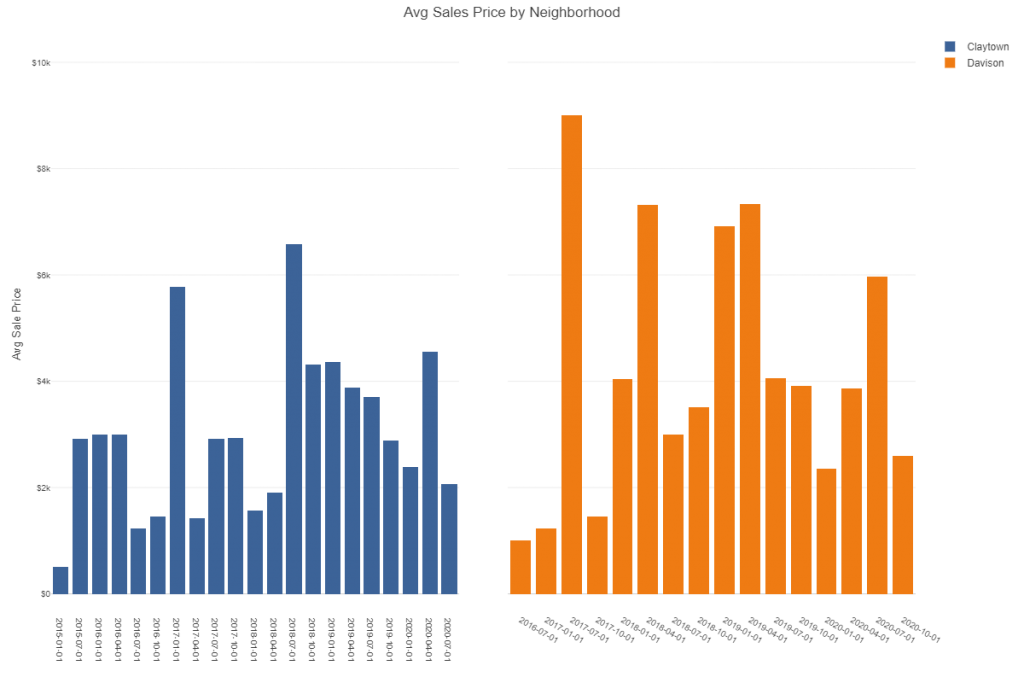
Interesting – each neighborhood has quarters where the average price dips below $2,000, about the average price across the city. Yet there are other quarters where the average sale exceeds $6,000 or even $8,000. This suggests that certain types of properties coming on the market may significantly inflate the average price. What we are missing here is the distribution of sale prices, which would help explain why these two neighborhoods stand so far above the other high volume areas. Let’s fix that omission by examining all sales using a box plot, which will show us the full range of sale prices for each quarter.

Now we start to see why the averages are so high for these two neighborhoods – Claytown has a property that sold for about $20k in Q1 2017, and multiple others reaching $10k or higher. Davison shows an even greater high end with a Q3 2020 property selling for about $25k and a few other quarters with sales above $15k. It will be very interesting to see exactly where these properties are located and to understand why their selling prices are so high relative to the program average. We’ll save that deeper investigation for our next post.
Summary
In this post we used visual exploration to begin to gain an understanding for sales volumes and prices for the Detroit Land Bank Authority initiative. Using a combination of calculations, charts, and maps we gained our first understanding for how this program is functioning across the city. In future posts we’ll dig in deeper to understand behaviors at a sub-neighborhood level, zooming in to specific city blocks using some detailed maps. I hope you found this interesting and will stay tuned for future updates. Thanks for reading!