Overview
One of the main challenges faced by data analysts and visualizers (my peer group) is helping others to understand what the data is actually telling us. This is true whether the subject is business, baseball, or public health, as in the current environment surrounding Covid-19. Each of these domains has data that is merely noise, which often masks or distracts us from seeing the real story. In the case of baseball (and typically business as well), we have reliable data sources that have been around for decades, and that allow users and analysts to trust the underlying data, and reduce the noise level. At the very least, it makes it easy to spot irregularities in the numbers, and to track down the cause. However, with Covid-19, we are confronted with data that is reported differently by each state; there are often timing issues, missing data, and wholesale absence of some critical data that would help us better understand the situation. Michigan, for example, does not report on the number of hospitalizations, clearly an important data element. The end result is data that has little of the reliability and trustworthiness developed over the years in other domains. It is more difficult to separate the signal from the noise, but it can be done.
My job in this post is to cut through the noise to identify patterns (the signal) that are entirely missing from nearly all political and media discussions. Let’s get to the truth on Covid-19!
First, let’s give credit to the data sources and tools I’ll be relying on in the rest of the post:
- All data used in this post is sourced from the COVID Tracking Project, except for state population estimates provided by the US Census Bureau
- Data analysis and chart creation will be performed using Exploratory, a powerful analysis tool based on the R language
- Maps will be created using CARTO, a web-based mapping platform
Next, let’s talk about what I won’t be addressing in this post:
- The effectiveness (or ineffectiveness) of lock-down policies at the state level. Others have done analysis on this and shown near-zero correlation
- The role of masks and social distancing in reducing or not reducing virus transmission. This is a particularly contentious minefield split largely along political fault-lines, and would require a completely separate analysis
- The role of underlying health conditions in creating susceptibility to the virus. This is a topic which has been widely covered by others (https://time.com/5825485/coronavirus-risk-factors/, https://www.usnews.com/news/healthiest-communities/articles/2020-04-22/obesity-hypertension-most-common-comorbidities-for-coronavirus-patients), and is not a part of my analysis. Likewise, I will not be speculating on future health effects for some of those who were hospitalized by the virus
- The political aspect of the reaction to the virus in a contentious election cycle
What this post will focus on is looking at the numbers, reducing the data noise, and demonstrating the real level of risk posed by the virus at an aggregate level. I will make every effort to place the numbers in context, something that has been sorely missing from political decisions and mainstream media reporting. In short, I will do my best to overcome the politically charged innumeracy running rampant in coverage of the virus, which has led to many decisions being made using misleading data. This post is not about favoring one side or the other in an election year, but an effort to get to the truth, driven by data rather than emotion.
Which data matters…and which is noise?
Let’s start by defining noise and signal, by using a definition from noted data analyst and author Stephen Few’s book Signal: Understanding What Matters in a World of Noise:
“Assuming that data is accurate, it is merely a collection of facts. When a fact is true and useful, only then is it a signal. When it’s not, it’s noise. It’s that simple.”
In nearly any data set, there is far more noise than there is signal. Further, it often takes a lot of work to arrive at the signal; it is much easier to create sound bytes from the simplest aspect of the data. This data may in fact be true, but it often fails the second part of Few’s test; it is not useful without placing it in the proper context. Typically, this leads to a focus on what I call the “counting statistics”, easy numbers with no need to do any calculations, understand context, or create deeper engagement with the data. These numbers may contain some level of signal, but often they are merely noise, since they seldom have any context.
Let’s look at a simple example – New York City and Baltimore had very similar homicide counts in 2019, with 348 in Baltimore and 318 in New York City. Similar numbers, right? Except for one problem – New York City has 14 times as many residents as Baltimore, so the homicide rates are wildly different. The population number provides context by allowing a rate to be calculated, but how often have you heard the media quote the homicide rates? The raw numbers fail to tell the full story, which is that Baltimore is a far more dangerous place than New York City based on homicide rates. In this case, the raw number is nothing more than noise; it can help us calculate a meaningful rate, but as a standalone number, it tells us very little. Worse yet, it may lead people to the wrong conclusion. The counts alone are noise, the rates are the signal.
Businesses make the same mistake when they simply tout the number of users of a product or service. Taken alone, the number represents little more than noise. What we really need to know is context that can help us get to the signal within the data. To do this, we need to ask critical questions: What is the potential market? What is our market share? Are we trending up or down compared to last year? Do we have happy customers who will continue to buy our service? These are the types of measures that will tell us how the service is performing. These questions help us get to the signal.
So why do the media & politicians focus on noise rather than signal?
Consider the old media maxim “if it bleeds it leads”. This was a rather crass way of saying that sensational headlines were to be the focus of the nightly local news (“3 dead in the south end, story at 11”) rather than any insightful analysis that viewers might not follow or find boring. So sensationalism it was, especially on television, and especially at the local level. In contrast, newspapers once had a reputation for being somewhat more nuanced, with editorial pages presenting an issue, perhaps even reflecting both sides of said issue, before arriving at a conclusion that reflected the paper’s overall editorial stance. In Detroit, for example, this would mean the Detroit Free Press tilting to the left, with the Detroit News to the right of the spectrum. Opinion pieces were saved for the editorial pages, leaving actual news reporting fairly objective.
Now consider how the current media mix has shifted to the equivalent of the local news, with 24/7 broadcast and online media rendering print journalism all but obsolete. The difference is that the current media has an impact many times larger than traditional local news. So we now have CNN, NBC, Fox, and others mimicking the “if it bleeds it leads” strategy, but fully infused with their editorial stances, making many stories political, even when they shouldn’t be. Even (or especially in some cases) newspapers follow this strategy as they compete for readership and advertising dollars. So CNN, NBC, and the New York Times run stories that are favorable to the left, Fox News and Breitbart do the same for the right, and those of us who care about the truth have to work long and hard to find it, especially in an election cycle where social media combatants bombard us with cherry picked stories based on their personal allegiances. Essentially, we have to find the signal on our own, because the media (and their political allies), focus on the noise in the data.
A quick exercise, framing the same (actual) numbers with and without context. Which headlines sound more tantalizing as a reader?
- 61 COVID deaths in Michigan over last 7 days (noise)
- COVID deaths increase by 1% last week, down from prior week (signal)
Note that we haven’t even mentioned that Michigan has a population of 10 million people; the total COVID death rate (possibly inflated by assumed COVID deaths), sits at .062%, or roughly one of every 1,600 residents, nearly all of whom were in one or more high risk categories. For the average person in good health, the rate is likely closer to 1 in 10,000 or even higher. This gets us to a much more precise signal, giving us useful information that accurately reflects the true risk associated with the virus. Yet it doesn’t exactly support the Black Plague sort of fear the media and politicians have used to lock down the economy.
Another example:
- Positive COVID tests climb by nearly 2,000 over last 7 days (noise)
- 98% of COVID tests in Michigan were negative last week (signal)
Now guess which ones are going to be featured by the media and politicians? The two noise headlines seem designed to incite panic and a call to political action by fearful constituents. The signal headlines do just the opposite, by placing the numbers in context. Same data, but one is incomplete and potentially misleading, while the other provides a more nuanced view. We can add more context to sharpen the signal by noting that the vast majority of those testing positive will likely have no significant issues, and may actually benefit in the long run from building antibodies against the virus.
To recap:
- Noise (for example, the counting statistics) is easy and often dramatic, especially among those with little background working with data. Much of the general public is innumerate, and cannot call out the media and political classes misusing data (to be fair, the media and politicians largely suffer from the same condition, so a case of the blind leading the blind)
- Signal requires more effort, and is unlikely to generate passion on social media. It is however, far more useful for effective decision-making
Finally, we get to the charts!
I would like to start off with a recent example that deftly illustrates the difference between noise and signal. Florida, along with several other Southern states, has recently been in the news cycle for the record levels of positive COVID test results (often misleadingly termed “cases”). Notwithstanding the accuracy or categorization of positive tests, do they meet Stephen Few’s definition of signal? Or are they merely more noise, perhaps designed to effect a political outcome? Let’s examine things visually to arrive at an answer, using Florida as our example. We’ll begin with the total number of positive tests:
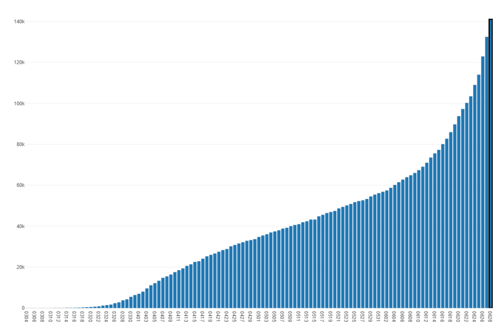
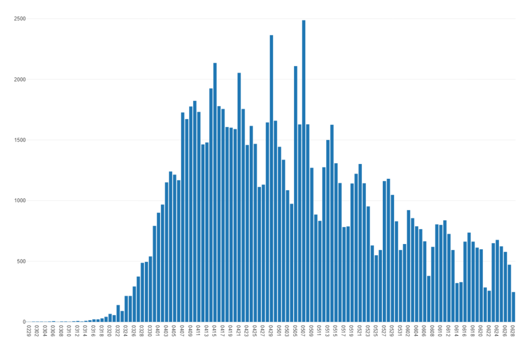
Note the fairly sharp increase in the slope of the curve starting in mid-June. Is this real, or simply reflective of more people testing? Or perhaps dirty data, where test results are not accurately counted? To show this pattern even more clearly, look at the daily increases in positive results. This is what the media is hammering us with on a regular basis:
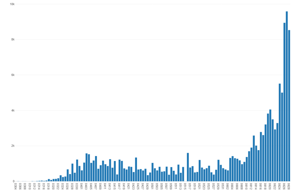
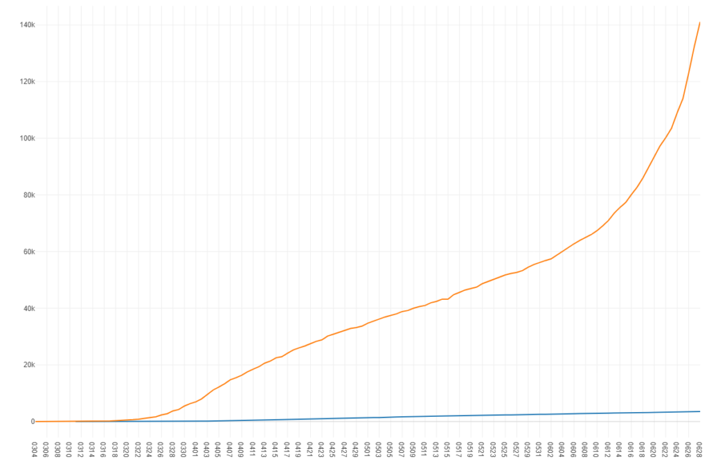
Whoa! Anything seem unusual here? As a long-time data analyst, I would certainly be exploring why my numbers have changed so dramatically, after more than two months of relative calm. Is this change real, or is it the way the data was captured? Is it meaningful (signal) or merely noise? This is where the media accounts typically stop, as they now have a headline story conveniently coming from a state that was not as heavy on lock-down procedures as many states in the northern half of the country. Could this be political? Perhaps, but our goal is to understand whether it is even meaningful data. Let’s move to the next chart. Here’s the same data, except in a line chart, so we can compare the increase in positive tests with the increase in hospitalizations. Positives are the top line (orange), hospitalizations the lower (blue):
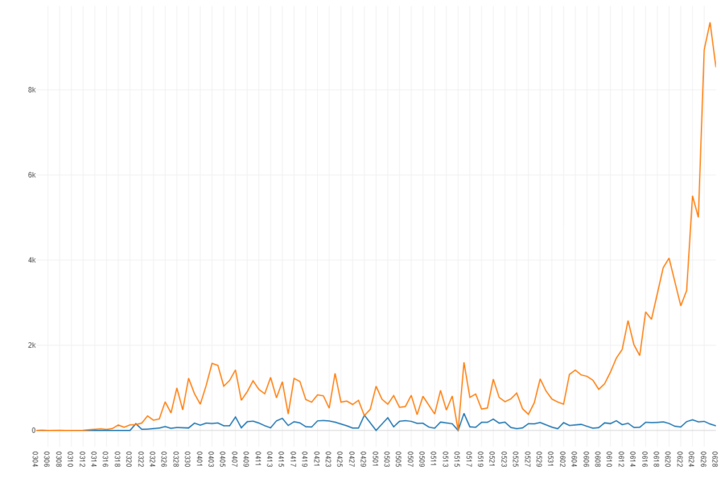
Does something seem a little off here? If positive tests are truly meaningful as a predictor of COVID mortality, shouldn’t we be seeing a concurrent increase in hospitalizations? Instead, that number continues to follow essentially the same pattern for the last 3 months. The two measures no longer correlate; positive tests now appear to be little more than random noise. Yet they continue to be pushed on us by the media, and have been used to shut down parts of the Florida economy.
Let’s zoom in on the daily increases in hospitalizations. Perhaps the pattern was masked by the scaling on the prior chart.
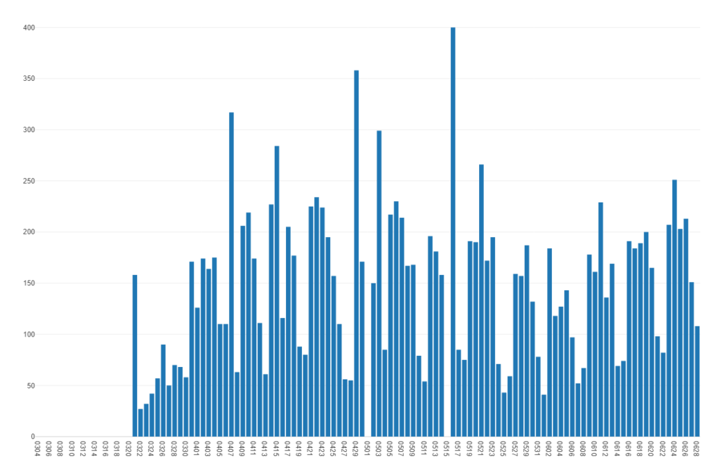
Nope, as we suspected, there is no sharp increase in hospitalizations, just a very slight uptick week over week in June, confirming that the positive test numbers are nearly meaningless. They have become noise. Building stories based on these numbers is misleading at best, and quite irresponsible.
The next chart examines the cumulative numbers of positive tests relative to COVID deaths. As you might anticipate, the relationship continues to weaken; perhaps positive tests are pure noise at this point, as the virus has already taken the most vulnerable, and no longer represents a significant threat to the general public. In any case, it is evident that the media is using scare tactics by doubling down on an increasingly noisy piece of data.
The Florida example provides ample evidence that the media, politicians, and most of social media are obsessed with the noise portion of the data, while failing to examine the signal. This is driven by a dangerous mix of innumeracy and politics, in varying proportions (I won’t speculate on the mix). I could draw many other examples that would follow a similar theme; one such example is treating rural areas and states with the same heavy-handed approach found in urban areas possessing entirely different densities, demographics, and risk factors. Michigan presents a classic case where rural counties with no cases were treated the same as Detroit, with it’s higher risk population. One could make a compelling case that this was nothing more than pure politics at work, with utter disregard for the data signal and the ability to leverage the data noise to exert political control.
Why the sudden focus on positive tests? Because the real crisis (overblown as it was) has truly passed. The goal now seems to be to keep people uneasy and fearful, despite the enormous drop in fatalities shown in the chart below. Note that we have removed New Jersey, which for whatever reason had a reported number on 6/25 that looks like many days worth of deaths rolled into a single day (i.e.- dirty data).
Now that we have dropped to low mortality levels, the media and politicians can no longer rely on high ongoing death numbers, so it appears the new tactic is to fan the flames with the meaningless positive test figures.
And finally a map…
With all of the focus on Florida, Texas, Arizona, and other states with alleged outbreaks, the reality turns out quite different. Perhaps their mortality numbers will grow over time relative to the northeast, but there’s a lot of catching up to do. Clearly, the northeast dominates the mortality rates; perhaps this explains all the media attention, given New York City’s role as a media hub? Would we have seen the same level of hysteria if Iowa had been at the epicenter?
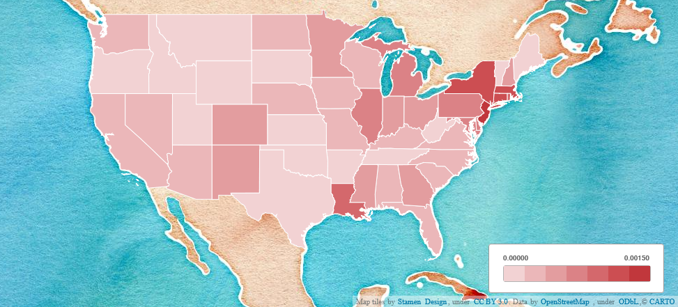
As shown on the map, where darker colors represent higher mortality rates, here are numbers through June 28th:
| State | Death Rate | One Death per… |
| New Jersey | .00169 | 1 per 593 people |
| New York | .00128 | 1 per 783 people |
| Connecticut | .00121 | 1 per 826 people |
| Massachusetts | .00117 | 1 per 855 people |
| Rhode Island | .00088 | 1 per 1,143 people |
| Georgia | .00026 | 1 per 3,822 people |
| Arizona | .00022 | 1 per 4,584 people |
| Florida | .00016 | 1 per 6,105 people |
| South Carolina | .00014 | 1 per 7,191 people |
| Texas | .00008 | 1 per 12,117 people |
Summary
The media and politicians have dominated the COVID discussion by using noisy data (# of positive cases) to prolong the COVID hysteria long after the real crisis (overblown as well) has passed. Any analysis and coverage that focuses on positive tests without measuring hospitalizations and deaths should be seen as fearmongering, and is likely to have a political agenda behind it. Whether it is COVID or some other purported crisis, we need to go beyond the shallow information passed by the media and politicians, and simply reject these, especially if they are used as divisive tactics. Teach yourself to focus on the signal, not the noise, and you will be well equipped to discover the truth, and not live in fear of the latest media-driven scourge.