No story about Detroit would be complete without a look at the criminal activities that so frequently mark life in the city. Detroit is not unique in this respect, by any means, and has in fact looked relatively good in recent years compared to ascending (in crime rankings) cities such as Baltimore and St. Louis. Nonetheless, as with all large cities in the U.S., crime is an ongoing concern, particularly in many of the city’s poorest neighborhoods. Our job will be to analyze (not sensationalize) this data, place it in context, and understand where criminality is most prevalent.
In order to understand these patterns, I’ll be presenting an ongoing visualization series on crime in the D using data from the city’s open data portal, a great resource for learning more about the city, both past & present. Here we can locate data on public health, city boundaries, transportation, property, and of course, public safety. Our data for the entire series will be sourced from the RMS Crime Incidents dataset, which contains this introduction:
“This data reflects reported criminal offenses that have occurred in the City of Detroit. Offense data was extracted from the Detroit Police Department’s records management system. This data set contains the most recent data available and is updated anytime DPD sends official crime records contributing to the Michigan Incident Crime Reporting (MICR) or the National Incident Based Reporting systems (reflected by the IBR Date field). It should be noted that some incidents involve the commission of multiple offenses, such as a domestic assault where property was also vandalized. Accordingly, the data describe all offenses associated with all reported incidents.”
The RMS data is very rich, with detailed information related to time of day, day of week, specific location, crime category, neighborhood, precinct, and much more. I have loaded the entire dataset into Exploratory, where I can start to understand the data. Here’s an example, using crime incidents for the period from January 2017 through March 2020:
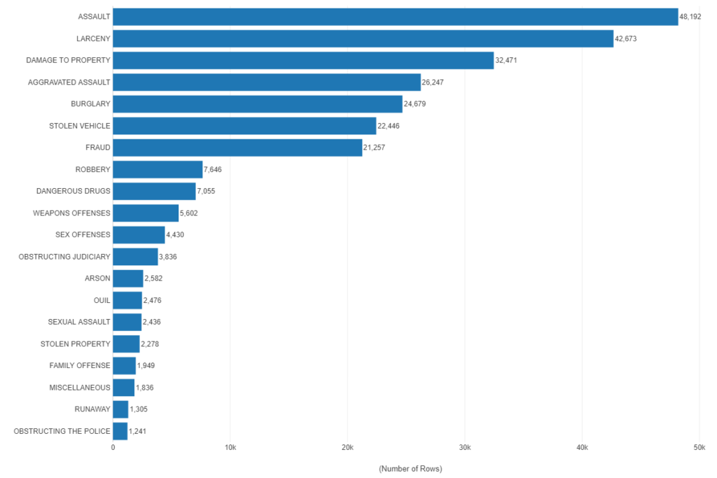
This chart makes it clear that Assault and Larceny are the two dominant offense categories in the city; what would be interesting is to see the same data by neighborhood, to see if certain crime categories differ based on the location of the neighborhood.
Speaking of neighborhoods, we can easily swap out the offense category and replace it with total crime by neighborhood. Ideally, we would like to merge population data to get a per capita crime rate, but for now we have simple counts:
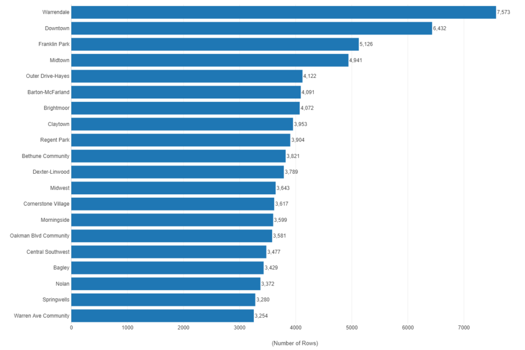
Some interesting numbers there, including perhaps a few unexpected neighborhoods. However, if many crimes are the result of opportunity, seeing Downtown and Midtown starts to make more sense. Still, we will eventually want to understand per capita rates to get a better picture of public safety by neighborhood.
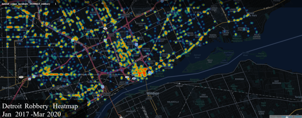
We’ll also have the opportunity to view this data geographically, using tools such as Mapbox and Carto. Here’s a quick look at a Carto heatmap showing robbery hotspots:
For a look at the live map, click the link:
https://kc2519.carto.com/viz/fa8c4403-9fdf-44ef-83a2-a3bfb0f551e0/public_map
So you probably get the idea that there are many different ways we can examine, analyze, and visualize this data. I’ll be adding specific topic-based blogs that will focus on crime categories, neighborhoods, seasonal and daily patterns, and a lot more. So come on back soon, and thanks for reading!