Here’s a simple map of Detroit neighborhoods based on census tract definitions. One of the interesting things to note with census tracts is that they are population-based, which can create some interesting effects when we view maps at that level. Densely populated areas will have very small geographic footprints, while rural areas could have a census tract stretching for many miles. The general rule of thumb I found was that a census tract in the US has between 2,500 and 8,00 residents – see here:
https://www2.census.gov/geo/pdfs/reference/GARM/Ch10GARM.pdf
In the case of a neighborhood map, the effect is mitigated, since each neighborhood is composed of multiple census tracts. Thus, we can view what might be considered easily understood boundaries, although some traditional names might not align with these official definitions. At some point, I’ll pull together a map based on census tract data, which will illustrate my point about size and density, and provide insight into some interesting population patterns.
In any event, here is the Detroit neighborhood map. The map is colored by neighborhood clusters; go to the live version to hover or click on the map to see neighborhood names and their size measured in square miles.
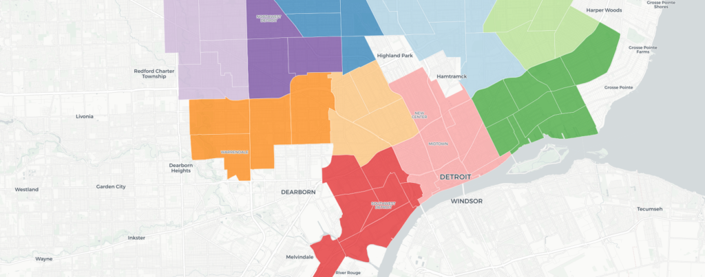
How do the sizes vary? The smallest neighborhood is Near East Riverfront, located in the area along Jefferson between downtown and the Belle Isle bridge. At 0.52 square miles, it is just over 10% of the land mass of the sprawling Mackenzie (5.06 square miles) neighborhood on the west side. In total, Detroit measures 139 square miles across 54 neighborhoods, making the average size just over 2.5 square miles.
Future posts will dive deeper into mapping and geo patterns, as I find this to be a fascinating and intuitive way to study the city, whether we’re looking at the past, present, or future. See you soon, and thanks for reading.