Crime patterns are an interesting study, because they don’t always conform to expectations. The conventional wisdom suggests that crime is likely to be heavier in the late evening and early morning hours, when the cover of darkness provides some level of anonymity for criminals. But is this necessarily the case? We’re going to investigate these patterns using our good friend Exploratory, and in particular, the violin plots feature.
So what are violin plots? While they may conjure up images of prohibition-era mobsters toting their guns in innocent looking instrument cases, the reality is they are one of the most useful and under-utilized analysis chart types. Here’s a quick overview from mode.com:
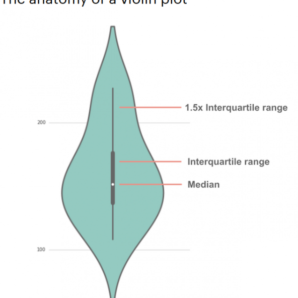
In a nutshell, violin plots expand on the capabilities of box plots by showing the true distribution of events, while also showing the median and interquartile range (25th through 75th percentile values). Instead of aggregating values while potentially hiding the underlying patterns, violin plots show all the curves in a distribution that lead to the median and interquartile numbers. Also, FWIW, violin plots are sometimes referred to as guitar plots. It’s up to you to select your favorite curvy string instrument.
The reason I have chosen violin plots will soon be obvious. I wanted to see the distribution of crime over a 24-hour day, and understand if different crime categories have their own distinct patterns, or if they all fit the conventional wisdom we shared earlier. As a reminder, we’re exploring data from Jan-2017 through Mar-2020, available at the Detroit Open Data Portal – https://data.detroitmi.gov/.
So on to the data, which we’ve arranged in Exploratory; hours of the day from bottom to top (0-24, or midnight to midnight), with a separate chart for each of the Top 20 categories. Let’s have a look:
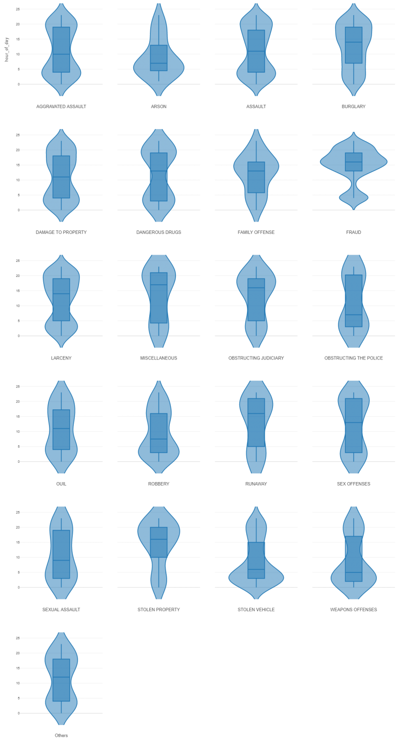
Wow! I think it’s safe to say that each category has it’s own distinct shape; some are similar to one another, while others are very unique. There are certainly several categories that fit the cover of darkness conventional wisdom, but there are others that are primarily daylight crimes. Let’s have a quick look at a few of the most interesting cases. We’ll start with fraud:
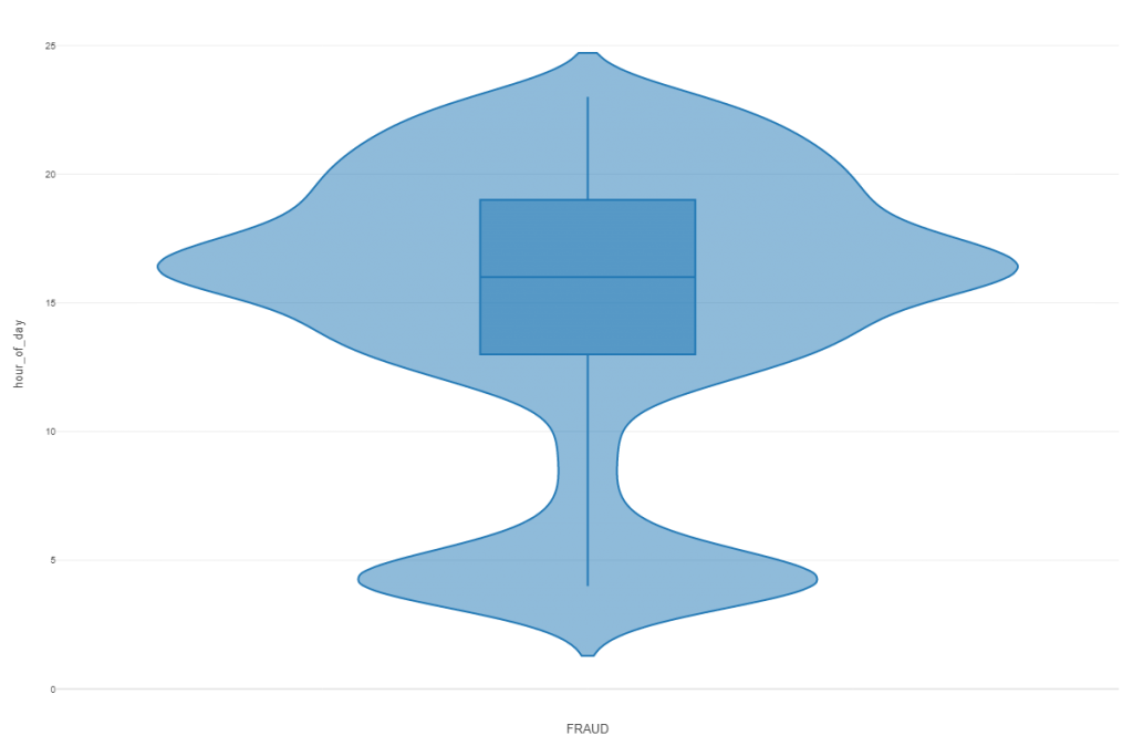
We can see the bi-modal distribution, with plenty of cases around 4 AM, and then a much larger number of cases in the late afternoon, where the median is centered. We can see by the boxed area that 50% of all fraud charges take place between roughly 1 PM and 7 PM; 50% of fraud arrests (the median line) have taken place by 4 PM. So we can conclude that fraud (at least from an arrest perspective) is largely a daytime crime, perhaps coinciding with retail store hours.
Let’s pick another interesting shape – arson. Arson perhaps fits the conventional wisdom more closely, as the plot shows:
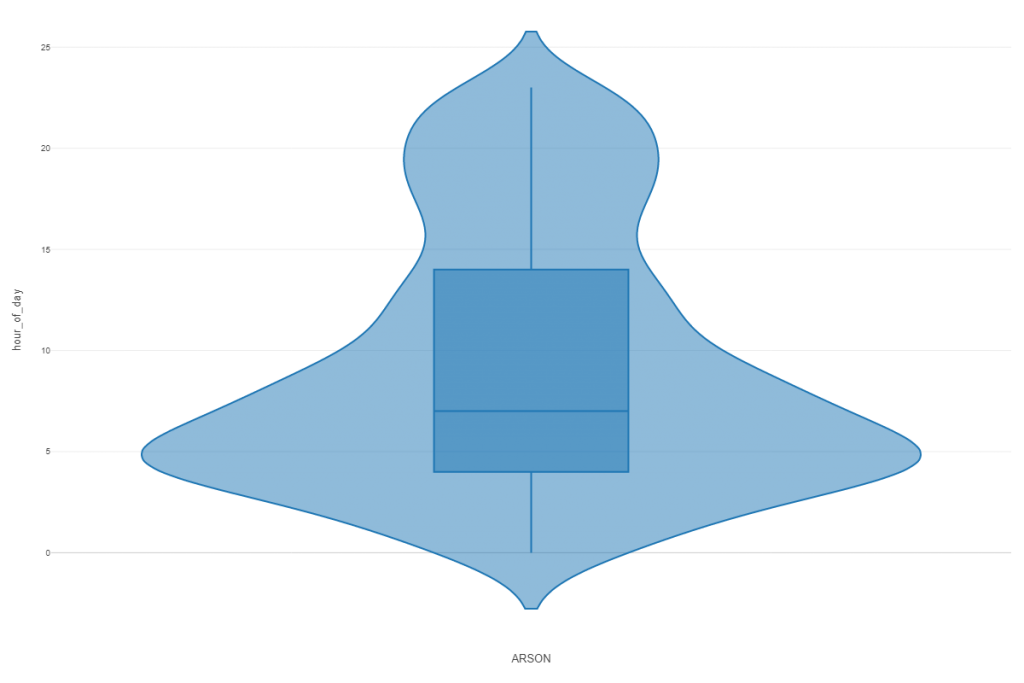
We see other categories that show similar patterns to arson, albeit less exaggerated. Robbery, stolen vehicle, and weapons offenses all belong to this general daily crime pattern.
Let’s look at one more before closing for now; we’ll revisit this data in greater detail in future posts. Here we look at Stolen Property offenses:
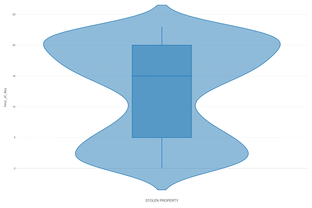
The stolen property distribution is intriguing, showing a very large peak around 8 PM, after which it tapers off before rebounding in the very early AM hours. 50% of all charges have been made by 3 PM, with 50% of our arrest totals occurring between 5 AM and 8 PM. I’m not sure of the cause of these patterns, and wonder if it could be related to police shifts and how they might drive arrest numbers. Still, if that were the case, we would anticipate seeing other plots with a similar shape, and no other categories show quite the same curves.
Clearly, we’ve barely scratched the surface here, discussing a mere three of the 20 plots. We could also use violin plots shaped by other variables – day of the week, month of the year, and so on. There is so much more data to be mined, and I’m eager to dive in, but not tonight.
I hope you are beginning to understand why I love violin plots, and why you’ll see more of them in these posts in the days and months to come. As always, thanks for reading, and see you soon.