Decided to have a little fun with Carto, by seeing how the simple People Mover route would appear using a variety of map backgrounds. For those unfamiliar with the People Mover, it is downtown Detroit’s elevated monorail system, transporting passengers around a single loop track. Here are the map results:
Each background provides something unique in viewing the same simple track layout:
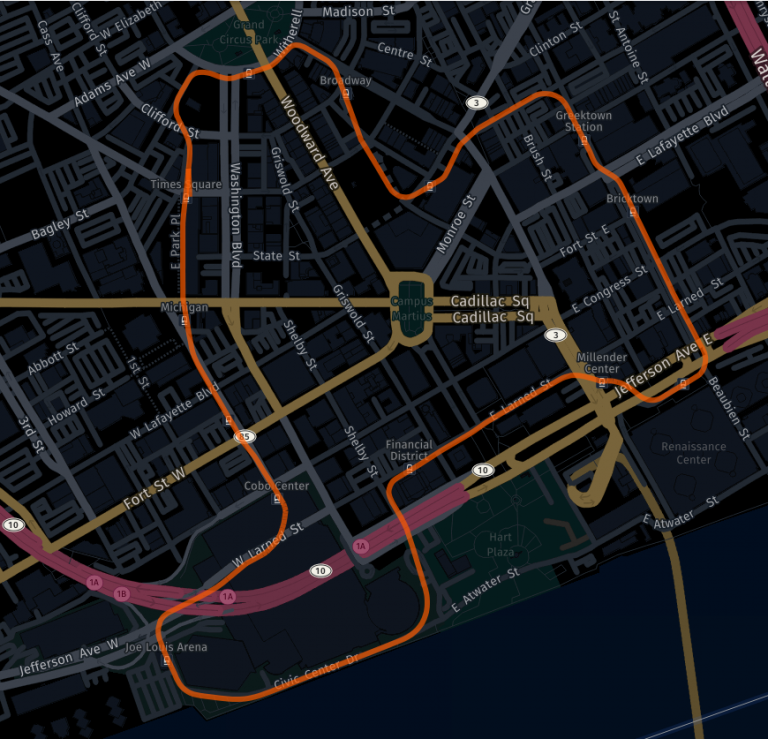
- HERE Night emphasizes main thoroughfares such as Michigan, Fort, and Woodward, without visually overwhelming the track layout
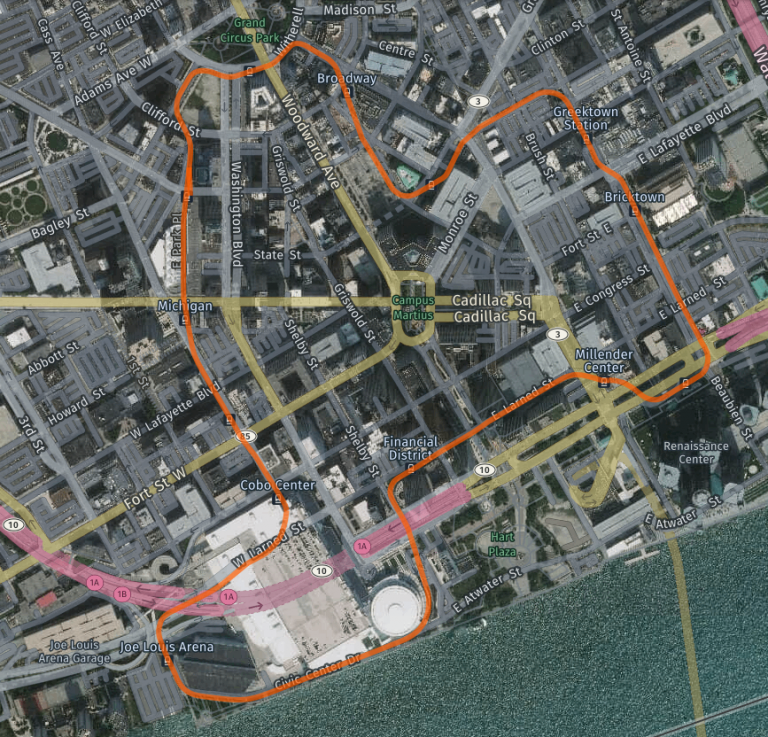
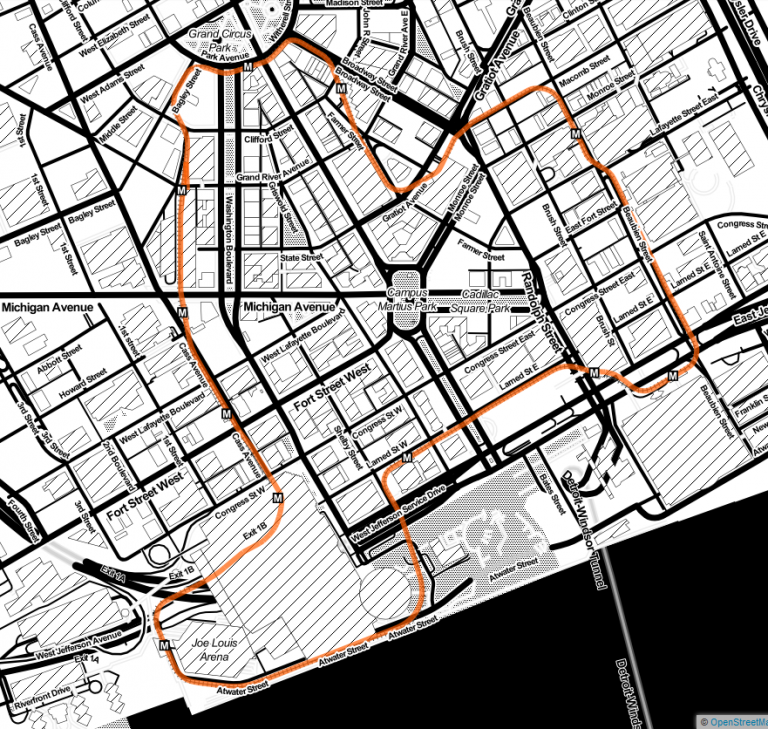
- HERE Hybrid Day adds buildings to the mix, and starts to get a little busy from a visual perspective
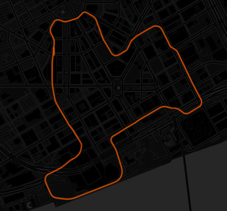
- CARTO Dark Matter (lite) provides a minimalist view, perhaps effective if you already know the street layout
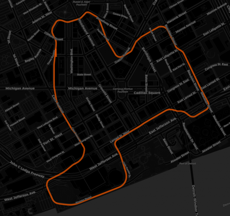
- CARTO Dark Matter adds street labels while remaining in the minimalist camp
- STAMEN Toner adds a lot of details, including People Mover stops, but makes it challenging to follow the track path
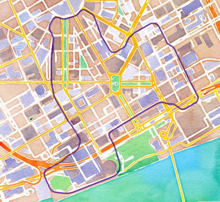
- STAMEN Watercolor is idyllic and provides a helpful grid, but without labels (note that we changed the track to purple for better visibility)
Is there a single best option here? I know I would eliminate the two in the center, as they provide excessive detail beyond the track map. I love the Watercolor look, but the lack of street labels might hinder someone visiting the city. Perhaps the Night and Dark Matter backgrounds work best, especially if we assume the addition of station markers to the map. My vote narrowly goes to the HERE Night background, as it’s subtle emphasis on secondary details provides important information without distracting from the primary intention of the map – to show the track path.
Hope you enjoyed this little exercise, and thanks for reading!