Having some fun analyzing and visualizing 911 calls in the city of Detroit, using data from the city’s open data portal. This is a rich data set with very detailed timestamps, geo locations, and call descriptions for each event. This data can lend itself to a variety of analyses – time series, mapping, categorical analysis, and various combinations of each of these approaches.
We’re starting with a 30-day dataset, but there is also a full set that goes all the way back to 2016. With the 30-day set I can test a few ideas, and then potentially apply them to the 6-7 years of full data. Think of the 30-day data as an incubator of sorts where I can throw ideas at the wall and see what sticks.
My tools for this excursion will be Exploratory for data wrangling, Flourish for charts, and Carto for mapping. Let’s take a look, starting with a partial view of the raw data:
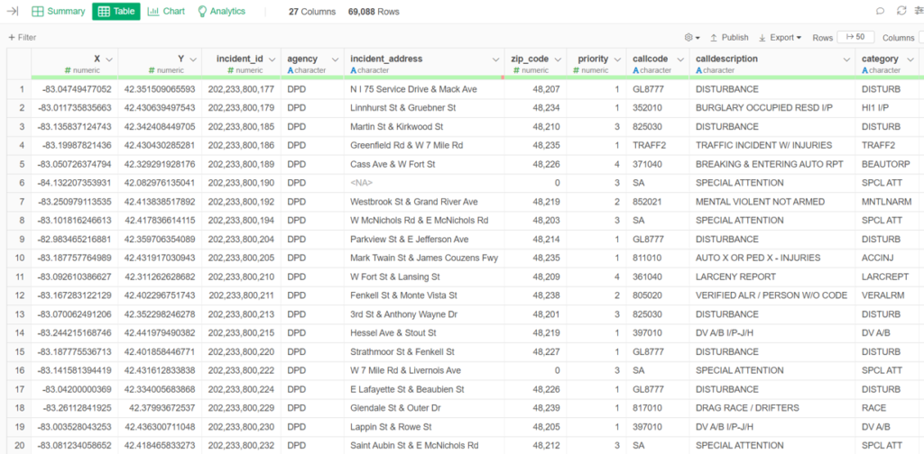
This is a great dataset for analysis, as you may gather from this small slice of the data. We have lat/lon data (the X-Y columns), very detailed intersection data, zip codes, call descriptions, and much more not shown in our limited space.
Let’s import some of our data into Flourish for data visualization. We’ll start with an exported .csv file created with Exploratory, and place our initial focus on viewing incidents by neighborhood, using a dropdown list so users can filter by individual neighborhoods:
We could just as easily view the same data using police precinct information as the filter:
How about some mapping, so we can easily visualize the data without the need to be familiar with Detroit neighborhoods. While Flourish provides some mapping capability, Carto is my go to for creating sophisticated maps with minimal effort. Here’s a view of calls by category where users can zoom in, hover, and click on individual incidents to learn more about the type, neighborhood, and time of the call:
Next, we can see a time lapse view of the calls overlaid on a map. We won’t see the categories by color in this instance, but we can get a very interesting picture for where the calls are being generated:
This was a simple overview of how we can view this interesting information. We’ll do a bit more analysis in upcoming posts, and may even jump into the full data going back to 2016. Hope you found this interesting, and thanks for reading!