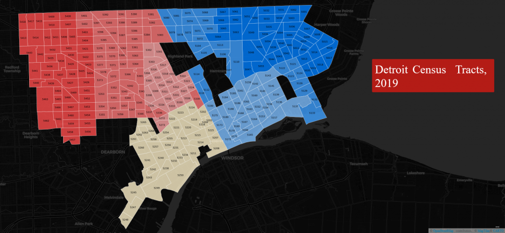
Here’s a little map I created using US Census Bureau data and Carto, showing the 2019 census tract boundaries for the city. After a few iterations, I used a Choropleth map, with colors based on the census tract numbers – not the typical approach for this type of map. Normally, we would color it by square miles, or population, or another countable variable, but in this case, the results give us a nice east-west split along Woodward, a very familiar boundary for Detroiters of a certain age. Southwest gets it’s own color here, based on the census tract numbering hierarchy.
For the live version, click here.