The Detroit Open Data Portal has some fascinating data sets to explore, analyze, and visualize. Anything from restaurant health violations to blight citations or fire incidents is available for download. For my initial series this year, I’m using the fire incidents data, which provides details on a wide range of calls where fire personnel were dispatched.
Let’s have a quick look at the details behind this data:
- Records from September 2016 to the current date (> 240k as of my download date)
- Geographic details at the lat/lon level
- Timestamp data indicating the call time, dispatch time, arrival time, and closed time for each record
- A huge variety of categories covering building fires, vehicle accidents, grass fires, stalled elevators, and hundreds more
This post will focus on the data details, data cleansing, and some calculations created in Exploratory, the powerful R-based tool I use for data wrangling and visualization. Let’s dive in to the raw data, downloaded in .csv form:
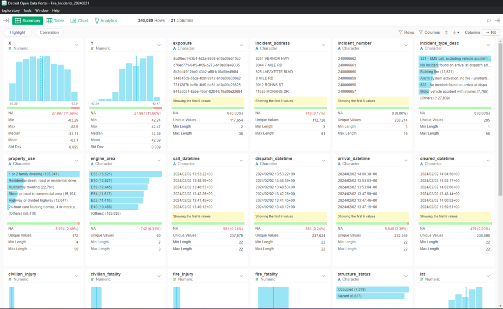
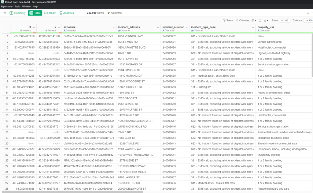
This is a summary view in Exploratory – note the 240,089 rows and 21 columns in the raw data. The same data can be viewed in table format:
Here we can see a handful of the 21 columns; the remainder are easily seen using the Exploratory scrollbar. At this point, we have the data we need, but we’ll soon find out that a lot of tweaks must be made – date formats, merging incident types into more useful groups, and so on.
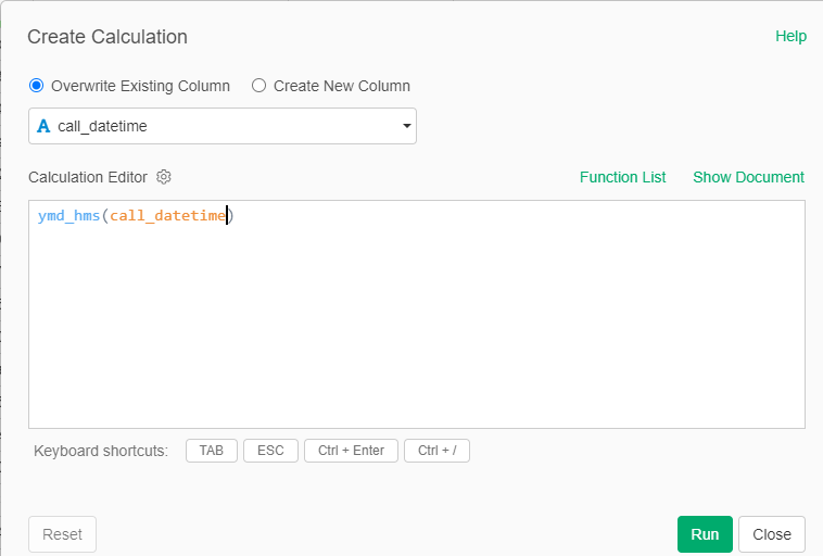
Exploratory provides great functionality for enhancing the data using a series of steps. Every good data analyst knows from experience that the data will need to be wrangled before it becomes useful for the eventual analysis and visualization pieces (i.e.- the fun stuff!). This data proves that to be the case in many ways, as we will now see in our series of steps. Let’s begin by making our various date and time fields more useful; in their current form they are too granular to use for analysis; as an example, here is our initial conversion for the call_datetime column, where we convert the raw data to a year-month-day-hour-minute-second format (ymd_hms in the calculation below). We repeat this process for each of our time fields. This will enable us to aggregate the highly granular data into days, months, and years in upcoming steps.
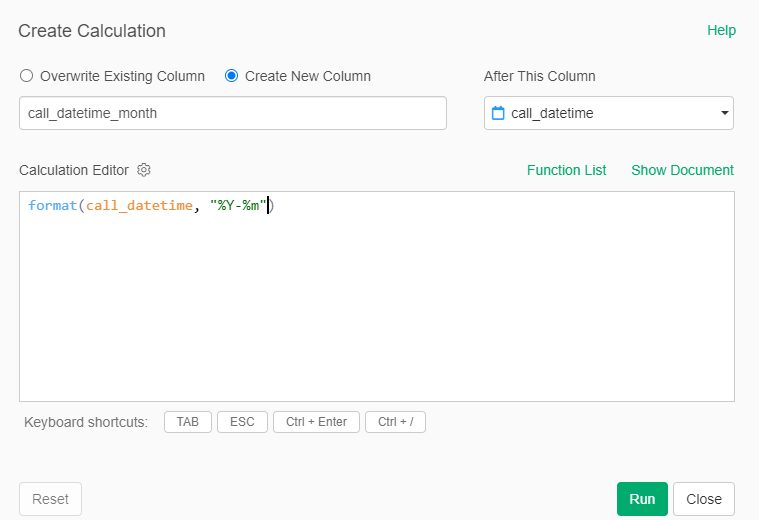
Continuing with the call_datetime column, we can now convert it to a year and month format – 2022-10 for example. This will facilitate some trend analysis over the several years of data.
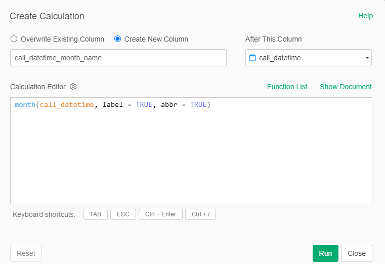
We can also easily convert the data to a new column using month names, such as Jan, Feb, Mar, etc. This will allow us to analyze the data for seasonality effects to determine if there are peak periods each year for the number and type of incidents.
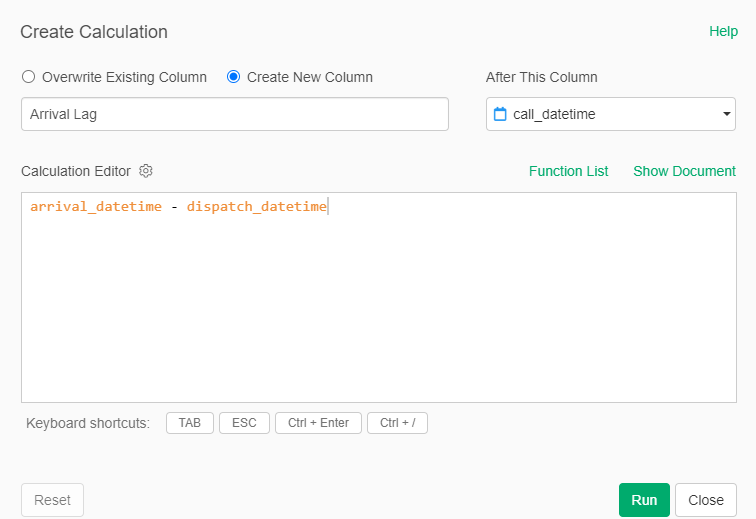
Another interesting set of analyses could focus on the average time between a call and the arrival of personnel at the scene of the incident. Since all dates are now in the same format, we can create simple calculations to derive the elapsed times, as seen here:
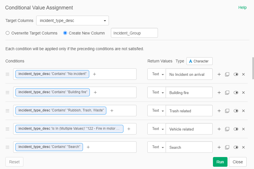
Enough about dates – let’s look at how we can categorize the incident types. The base data has 285 unique values for incident_type_desc, many of which are either redundant or closely related. They become perfect candidates for aggregating to a higher level. We can create a series of calculations within a single step, using a bit of trial and error along the way. By the way, don’t let anyone tell you that data science is 100% science; there is a large proportion that is far more art than science. Here’s a screenshot of some of the groupings I created:
These steps have gotten us closer to a robust data set we can analyze and visualize, but we’re not quite there yet. Turns out there are some quirks in the data collection process that need attention before we can provide honest analysis. I’ll walk through those in the next post. Thanks for reading!