In my last post I walked through some simple data wrangling processes used to create a more friendly and robust data source from the Detroit fire incidents data. In this post, we’ll finish the wrangling process and begin to visualize some of the data in Exploratory.
One of my recommendations as a long-time data analyst is to immerse yourself in the data using some simple approaches – basic line or bar charts will often reveal inconsistencies in the data. In order to build credible visualizations, it’s important to address these issues; often, they simply reflect a new way of capturing or identifying data, rather than changes in real world behavior. That’s exactly what we’re going to see with this data set.
Let’s start by viewing annual incident volumes:
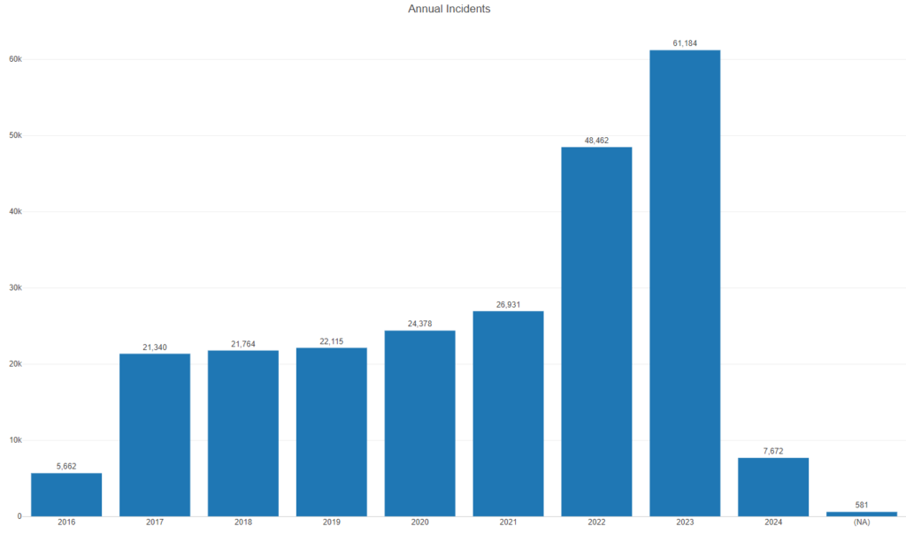
A few things are going on here – 2016 data has only 3 months accounted for, and we have a small number of records with invalid dates (NA). Same for 2024, with just 2 months of data. Those will be easy to filter out of our data. But what about the huge leaps in 2022 and 2023? Surely this can’t be actual growth in the number of incidents compared to 2017-2021. This is where we start digging into the data to see what is inflating the numbers for those years.
Fortunately, there is one incident type that accounts for nearly all of the jump – the addition of EMS (Emergency Medical Services) to the incident data. Have a look:
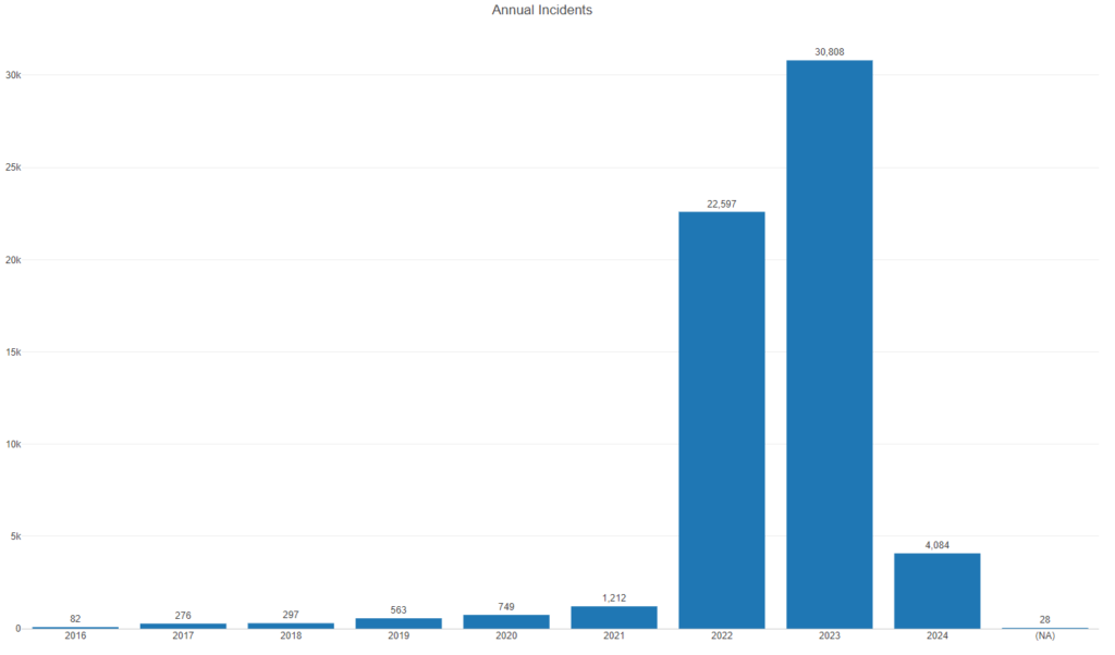
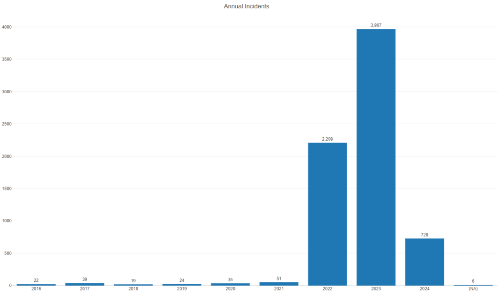
Clearly, EMS incidents have been added to the data set; if we want to do meaningful analysis, they need to be filtered out. A second category follows the same pattern – canceled calls:
Removing these two categories and limiting the data to full years should change our picture a bit:
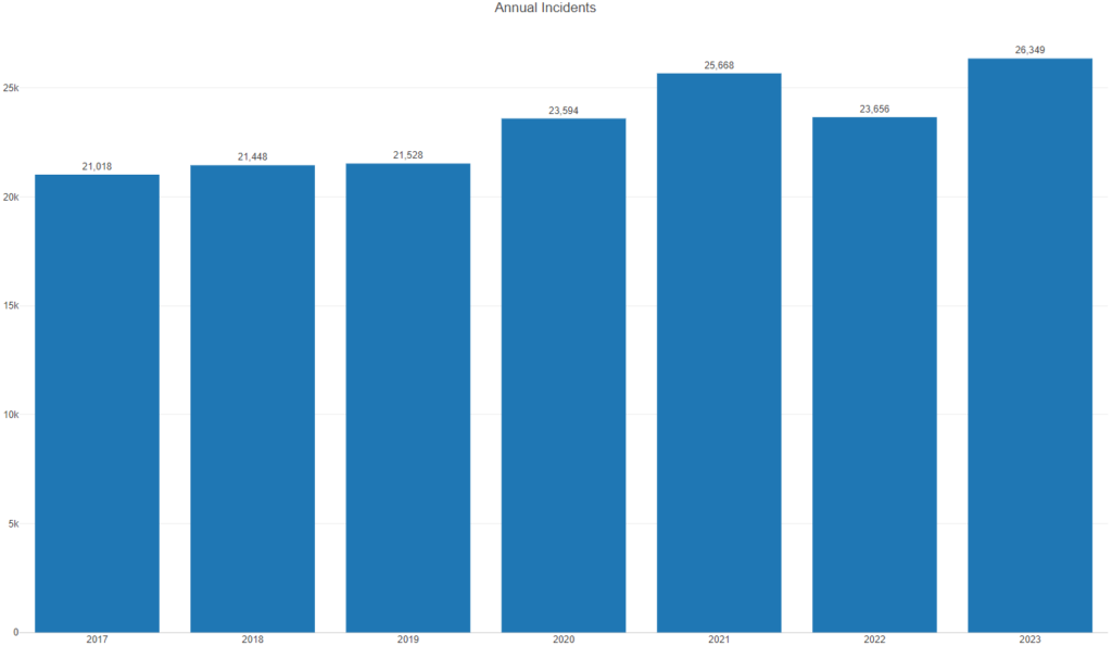
Much better! There are still some questions here, but the numbers are now in a more believable state. Still, 2022 is a bit unusual versus the overall trend, so let’s investigate by looking at monthly numbers:
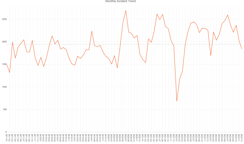
We see a huge drop in January 2022 counts, with February and March also very low. Looks like a missing data issue, and fully explains why 2022 numbers appeared to dip. Any analysis will need to account for this anomaly in the data – it’s clearly not a behavioral change.
We have seen the annual and monthly trend numbers for all incidents (other than EMS and canceled). The next step is to look at monthly numbers for the 2017-2023 aggregate. This will help us to see if fire incidents have a seasonal component. Let’s have a look:
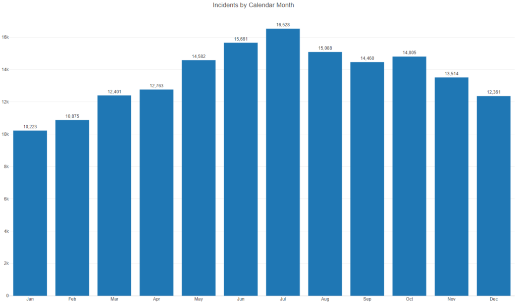
We certainly do see a seasonal trend, with the hottest months (June, July, August) showing the highest volumes. October shows a minor increase over September, but otherwise our data is almost a perfectly rendered normal distribution. Now remember the missing data from early 2022? Let’s see if it has any effect on the distribution by removing 2022 data from the chart. Now:
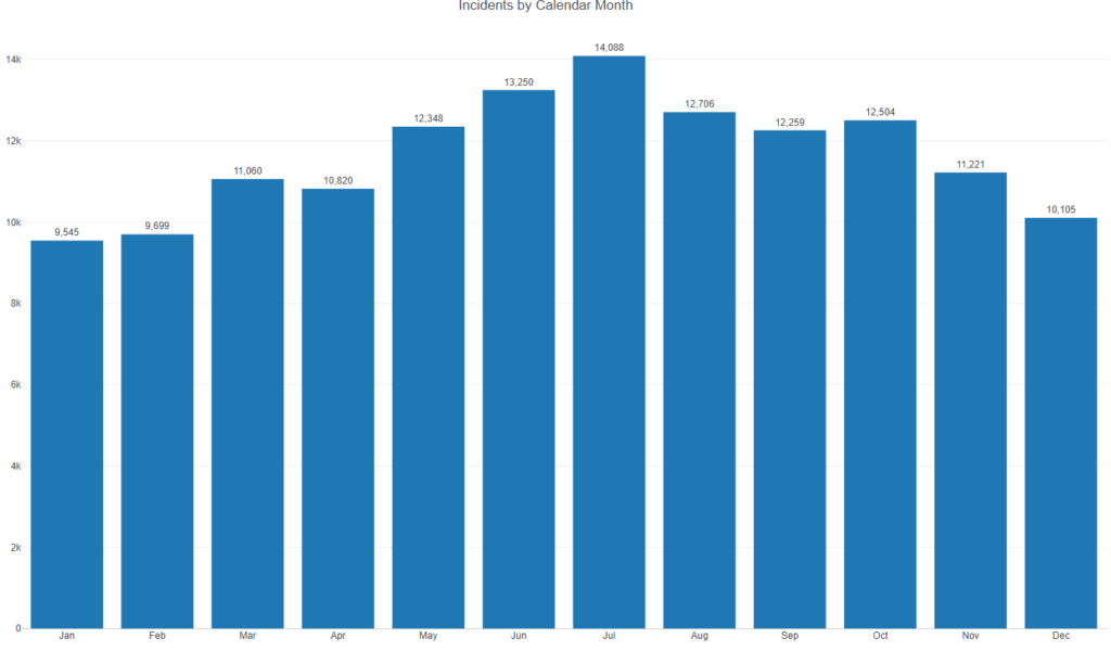
The change here is minimal – March surpasses April, but otherwise the changes are small. Good news!
Before closing this post, let’s have a look at which incident groups create the most volume. Recall in the prior post that I merged incident types into higher level groups for more robust analysis potential. Here’s what our Top 25 groups look ike:
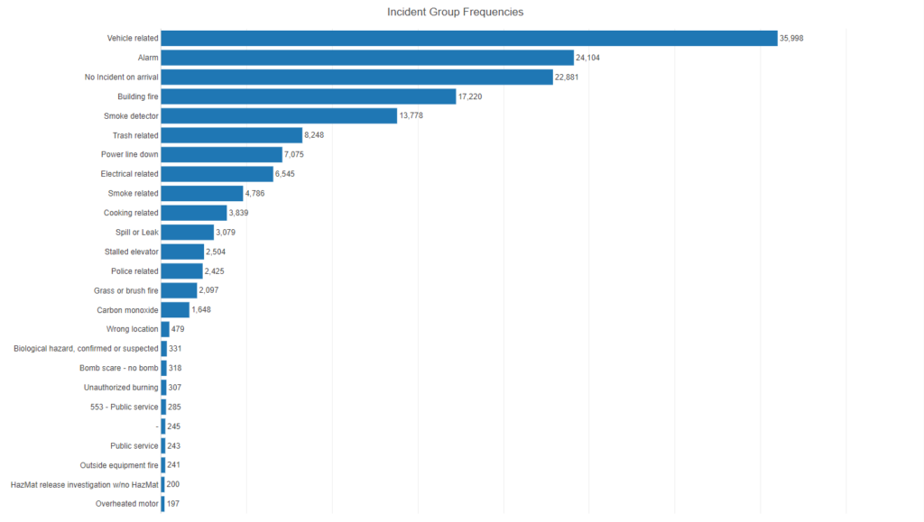
The first five in the rankings are far ahead of the rest of the group, led by vehicle related issues. This group contains vehicle accidents, fires, and so on, and is a very large number relative to all other groups. Alarms are also significant, as are no incident on arrival calls, with building fires and smoke detector issues rounding out the top five.
We’ll take a deeper dive into some of these high volume groups in the next post. Thanks for reading!