My latest data adventure comes courtesy of a generous dataset sourced from the Realtor.com website. This data is aggregated at a monthly level across all zip codes (no individual sales transactions). It’s really a great source to work with in understanding the ups and downs of real estate listings across many geographic levels. Once again, I’ll be using Exploratory to do the data ingestion and any necessary wrangling before jumping into the visual depiction of the listings.
Here’s a quick overview of some of the variables in the data:
- Year & month level dates
- Zip Code location
- Total listings on the market
- New listings in a given month
- Average listing price
- Median listing price
- Median square footage of listings
- Month over month and year over year changes in average and median prices
- Median # of days on the market
The dataset I downloaded contains monthly summaries from July 2016 until the present, so we have a lot of data to analyze – more than 2.5 million rows. My primary focus initially will be on Detroit zip codes, in an effort to understand how listing prices are trending, and whether there are hotspots around the city. Ultimately, I’ll push some of the data into maps, but the first step will be to comprehend patterns in the data using a variety of charts and other analytic approaches.
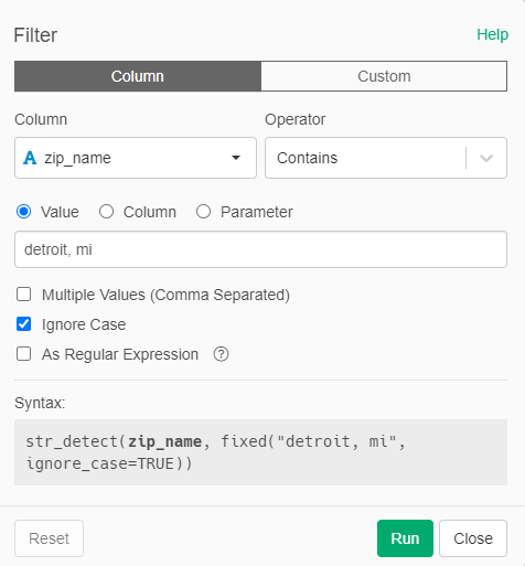
My first step is to limit the dataset to Detroit zip codes. Fortunately, there is a field called zip_name I can use for this purpose – no need to memorize all the individual zip codes.
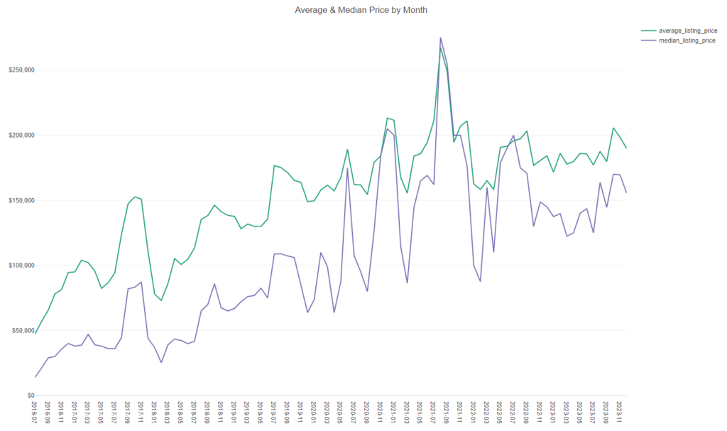
Our data set is now reduced to a very manageable 2,250 records – 25 zip codes across 90 months of data. We can now begin to visualize the data; note that I’m skipping over two minor date format modifications. Let’s have a first look at the data using average and median price levels across time:

I have to issue a quick caution here – these are averages of averages (or an average of the median). Since we don’t have individual records for each house listing, we are limited to an aggregate view at the city level, built on the zip code level summaries. Still, this provides us with a useful view of the pricing trend, even if it isn’t as precise as we might like. Clearly, both measures are moving in a positive direction over the 7+ years of records. If we view the same data at a zip code level, there are no concerns about this issue, as we are simply displaying the base level data across time. Our simplest way to do this is by building a parameter filter at the zip code level, which I’ll walk through below.
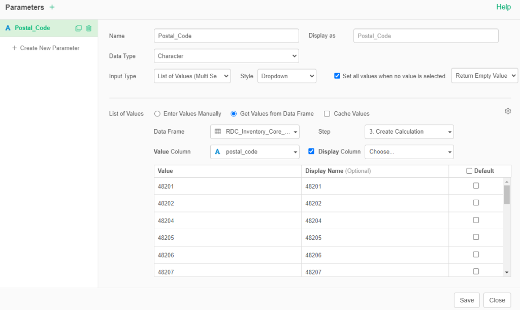
I built a parameter in Exploratory that uses the postal_code (same as zip code) column from the dataset, as shown below. We can then use this to easily filter our charts at the zip code level; we’ll look at an example in a moment.
Here’s what the parameter looks like as a filter:
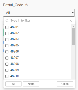
If we select the 48206 zip code, our chart updates to show only the relevant data; we can apply this filter across all of our charts as needed.
Another interesting item to explore is the number of listings on the market in a given period. Specifically, did we see any changes due to the lockdowns in 2020-21? Let’s have a look, first at the city level:
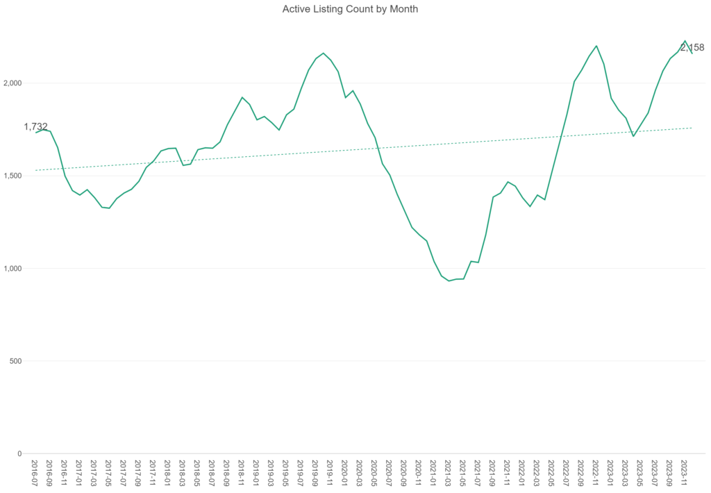
We have seen a significant increase in the number of listings since 2016, with a major dip in 2020 & 2021, as expected. The same is true for the 48206 zip:
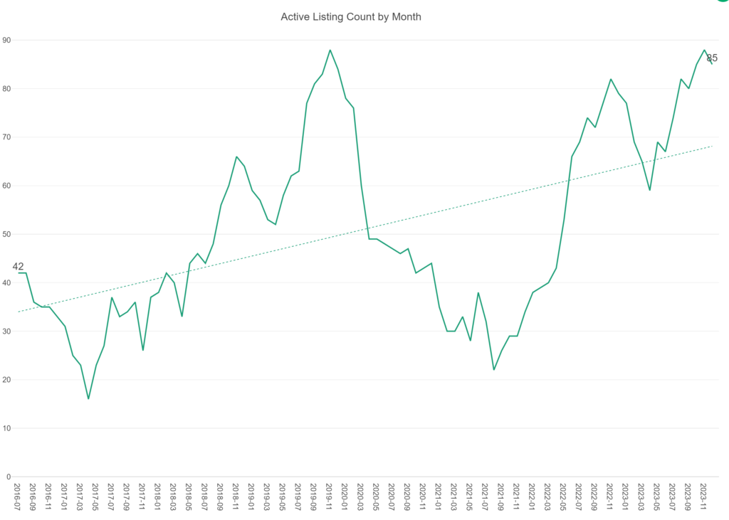
The COVID-19 hysteria clearly had a major impact on the number of listings in Detroit, and likely elsewhere in the nation. We may explore this data at a national level in the future to understand how Detroit compares with other major metro areas.
Let’s wrap up this post with two more line charts, this time examining month over month changes to the median and average prices. First, month over month changes to the median listing price:
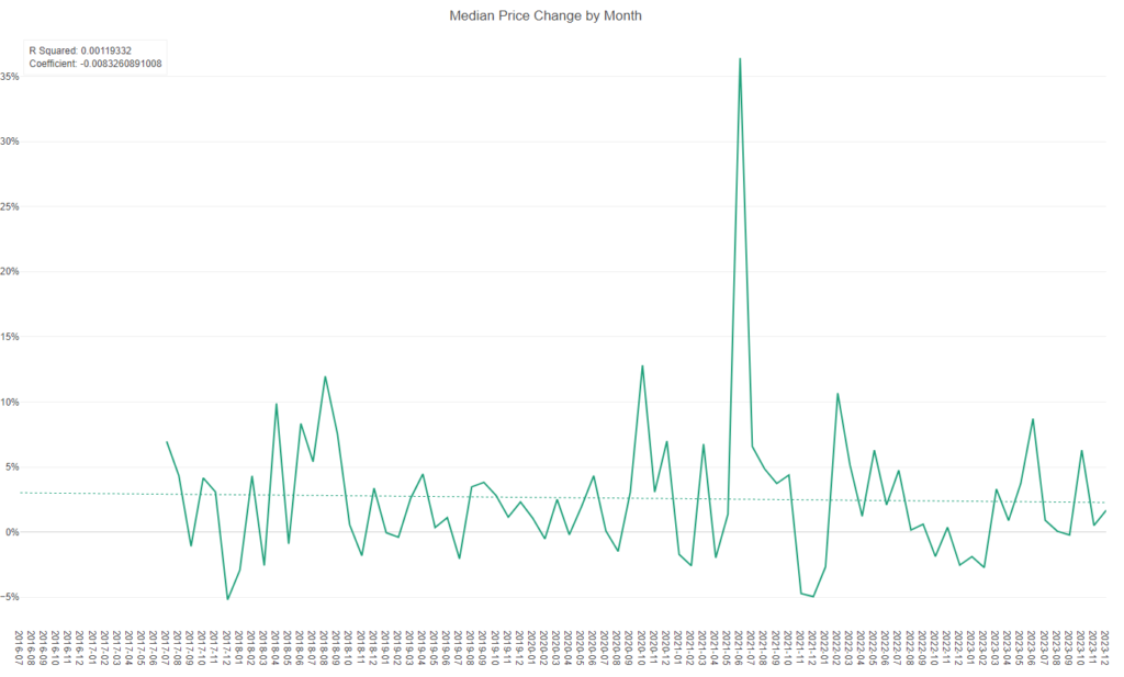
We are seeing a very random pattern here (not sure what’s up with 2021-07), with an R Squared value close to 0. In simple terms, we really can’t predict from month to month what the median price point will be, although the trend is generally a positive one, starting near 3% month over month before dipping to slightly above 2% in recent months. But again, the individual month changes tend to be very random.
The same pattern holds true when we look at average price changes:
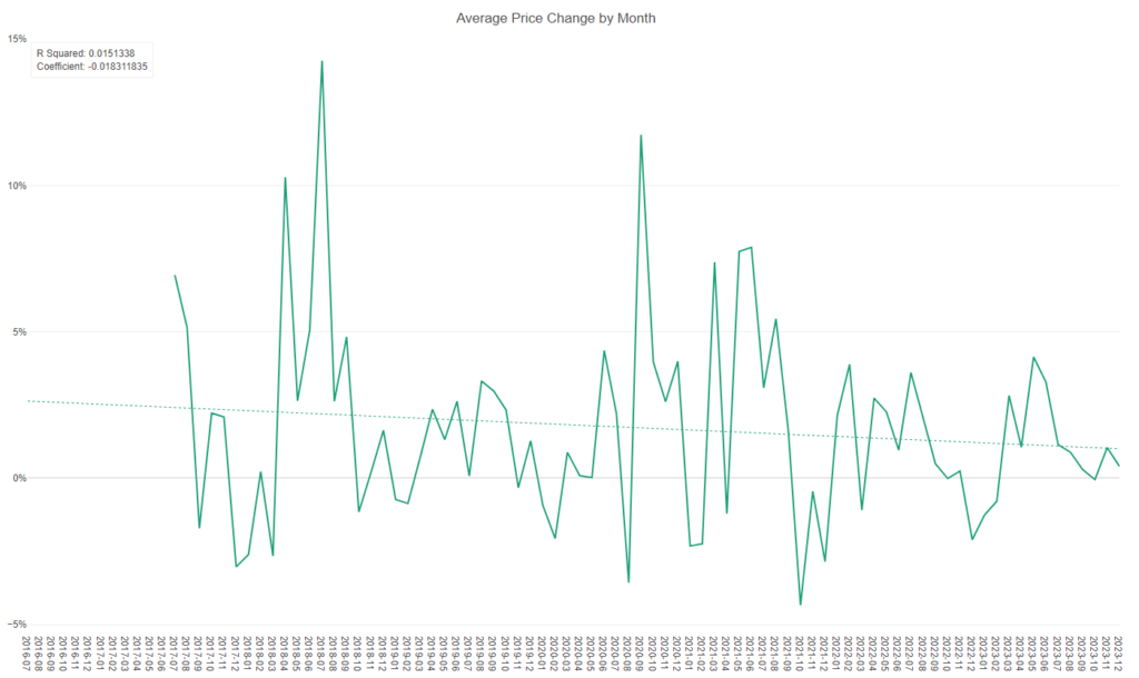
Once again, the monthly changes are effectively random, with the changes being a little more magnified both positively and negatively. This makes sense, as some very high (or low) listing prices will move the average more than the median; the median price will reflect the halfway point of listing prices. A majority of months here still show a positive change (> 0%), but the recent monthly increases have been a bit more modest in the 0-5% range. In summary, prices are generally climbing, but more slowly than in the 2018-2021 window.
My next post in this series will take a look at patterns at the zip code level to understand where areas rank in terms of listing volume, price, and square footage of the listings. Thanks for reading!