I created a visual analysis of purchases made under the Detroit Land Bank “Own It Now” program back in late 2020, attempting to shed light on where sales activity was occurring across the city. Now that we’re closing out 2021, it seems like an appropriate time to update the data and see what has changed over the last 14 months. Are the same neighborhoods still drawing the most attention, or have others become the new hot spots for buyer purchases? Is the average sales price climbing or falling? What other trends do we see? Let’s dive into the data using some visuals to understand how the program has evolved.
The Overall Numbers
As of our post in October 2020 there were 5,498 sales; this number grew dramatically over the last 14+ months to 8,650 sales:
8,650 Sales – a 59% increase in 14 months
What about the revenue associated with these properties? As of our October 2020 check-in the total sales revenue was sitting at $10.7 million. The latest number has jumped to $20.76 million, nearly doubling the previous figure:
$20,755,275 Total Revenue – up 94% in 14 months
With revenue growing by 94% while sales are up by 59%, the average transaction price has clearly grown. 14 months ago, the average price landed at $1,947; the new figure has jumped to $2,399, a 23% increase.
$2,399 Average Sale Price – an increase of 23%
Of course this new figure includes all the prior volumes from 2014 through early October 2020; what about the average price over the last 14 months? As expected we wind up with a significantly higher number – $3,113 for all properties with a closing date from October 2020 to the present.
$3,113 Average Sale Price from October 2020 to December 2021
The average price for the Own It Now program has clearly grown over the last year, raising some interesting questions:
- Has the price distribution shifted, with the numbers being skewed by a small number of higher priced properties?
- Is the property mix similar or has it shifted geographically or in the types of properties available?
- Are sale prices increasing uniformly across neighborhoods or do we see great variation?
In the next section we will examine these questions to better understand what has changed over the last 14 months as well as viewing results for the program since it’s inception.
Land Bank Trends
Let’s start with a look at overall sales trends since the start of the program:
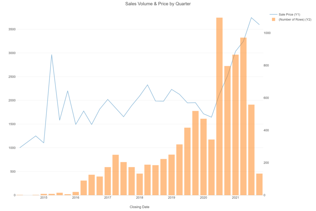
The quarterly data shows a dramatic increase in both sales volume and average price beginning in mid-2020 and continuing at higher levels for most of 2021. The 3rd quarter of 2021 peaks at an average price of $3,744 before we see a small drop for Q4.
For a look at transactions since the launch of the program we can employ a Carto torque map that provides a time-lapse view of sales to date:
Now that we have an updated sense for how the program is working since it’s launch, let’s look at more recent patterns.
Where are Recent Sales?
Here’s a heatmap (built with Carto) displaying sales locations from October 2020 through December 2021 – zooming in will provide a better idea of specific neighborhoods and streets with Own It Now activity:
Another approach to help us understand the current hot neighborhoods is to use a simple bar chart. Here are the 20 neighborhoods with the highest sales volumes in the October 2020 to December 2021 period:
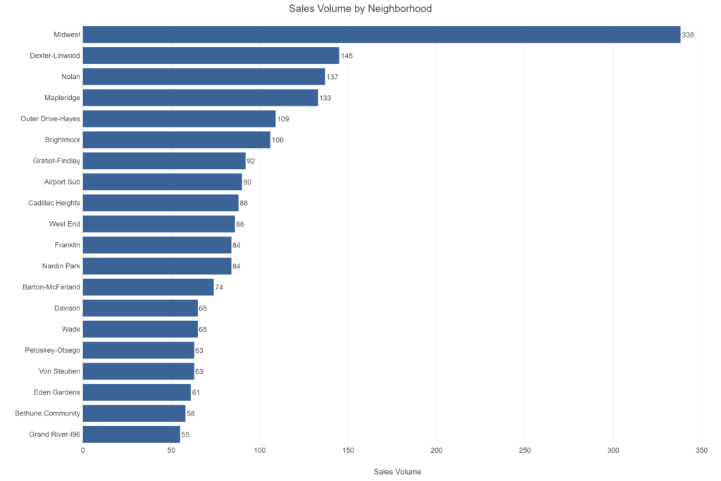
Wow – what is going on in the Midwest neighborhood – and where is this located within the city? Let’s filter our dataset to focus on this neighborhood:
It turns out this little known neighborhood is bounded by the Jeffries freeway (I-96) and Warren Avenue, with Livernois running through it in a north-south direction. This area is certainly not a frequent destination for visitors but it does lie in close proximity to several of Detroit’s more active neighborhoods, including Woodbridge, and is a short distance from downtown via either I-96 or Grand River. This may help to explain the growing number of properties purchased in recent months.
The next question to answer is what sort of price are these properties generating? We have a trio of charts to address that question. Let’s first view a simple bar chart of the most active neighborhoods (based on sales volume) with Midwest highlighted:
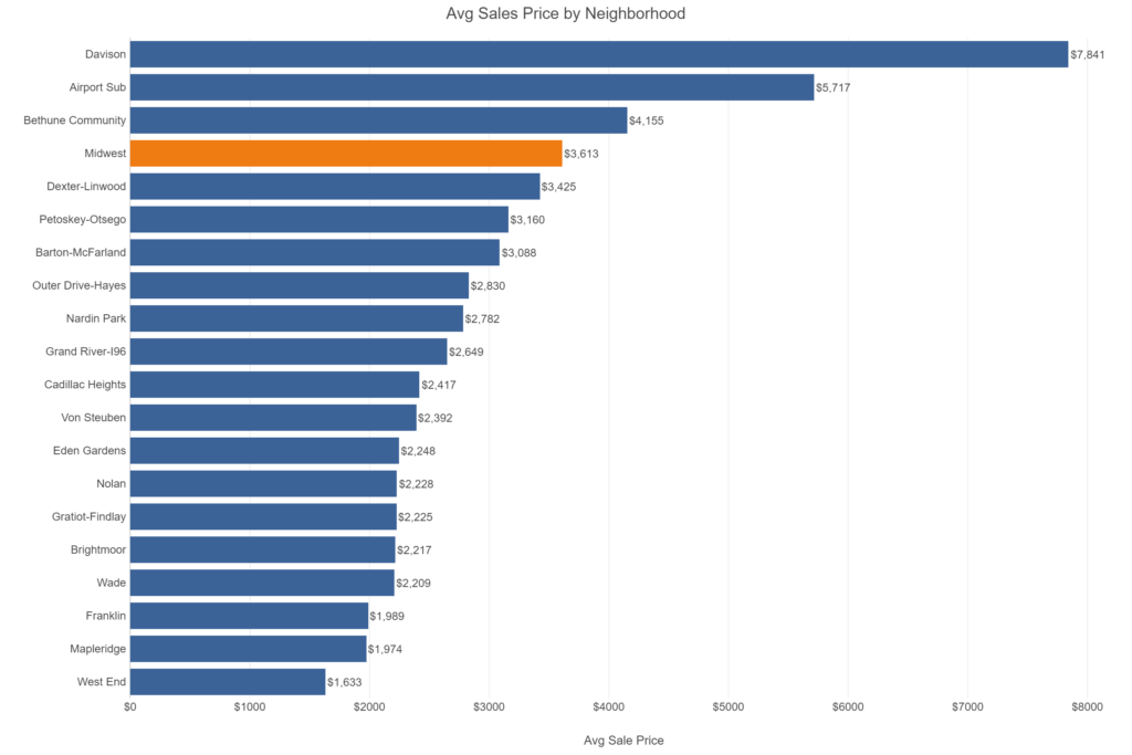
As might be expected, the Midwest neighborhood is in the top four on average price – demand for properties in the neighborhood may be driving prices higher. It is of course possible that we may have a few high transaction prices pulling the average higher. The average tells us part of the story, but in order to understand the full picture we want to examine the pricing distribution, courtesy of a violin plot. Here are the top selling neighborhoods – just 10 this time for greater clarity:
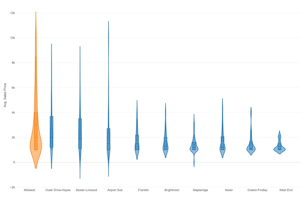
A quick note on violin plots – the box within the violin shows the middle 50% of prices, with the inner line showing the median price. We have filtered out outliers (unusually low or high values) to avoid distorting the chart. The violin plot for Midwest shows a wide range of values, especially when compared to Franklin, Brightmoor, and the others at the right of the chart. The median sale price is just $2,000, compared to the mean of $3,613 in the bar chart. Half the transactions are between the $1,000 and $4,000 levels, but clearly we have some higher priced transactions to uncover based on the long tail extending to the top of the chart. To find these higher values we’ll employ a scatter plot.
The scatter plot will show us sale prices for all 338 properties sold in Midwest over this period. As expected there are some higher price points, with several approaching or exceeding $20,000:
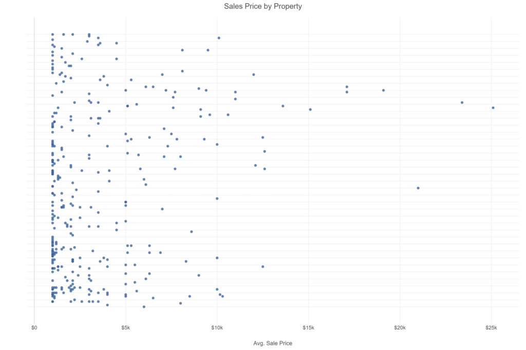
As the plot shows there are a high proportion of properties clustered at the low end near the $1,000 level, with a handful of much higher values bringing the average up; remember our average sale was $3,613. Clearly there is a wide range of transaction prices in this neighborhood.
Our final task is to place these properties on a map to gain a better understanding of the data. Using a choropleth map gives us the ability to see sales price ranges quickly – lighter circles indicates low values, darker colors represent the upper range properties seen at the right of the scatter plot:
Clicking on any circle will provide information on the closing date, address, and price for a property. That’s it for now – thanks for reading and I hope you found this informative.