One of the more interesting data sets I have viewed over the last several years comes from the Educational Opportunity Project at Stanford University, previously known as CEPA. The data sets I will use for this series of posts come from their SEDA collection, which is updated regularly with test results from primary school levels – some between 5th and 6th grades, other data at the 4th grade level. The objective of this series will be to show the negative (often disastrously so) impact the lockdowns had on primary school students.
These data sets are very comprehensive, covering results across all states at the local school district level. In order to maintain focus, and in keeping with the spirit of this site, we’ll initially work with data from Michigan. Our first post will look at grade level changes among 4th graders, comparing 2019 (pre-lockdown) with 2022 results. Many of the students in the 2022 results will have spent one or more years outside of school; while I am a believer in homeschooling for those who wish to go that route, the results will make clear that remote schooling was not a good substitute for those who remained in traditional school districts.
One of the apparent outcomes of the lockdowns was to exacerbate the gap between wealthier and poorer districts; this is quite likely the case, given that families in wealthier districts would potentially have greater resources available for remote schooling. Here is a paper detailing some of those findings. My objective here is not to compare districts based on wealth or other variables; the data and charts I will share make it clear that nearly all districts performed below 2019 levels, a collective failure that will likely cost students the equivalent of one or more years of educational attainment as they move through elementary, middle, and high school. In essence, we have likely created a self-inflicted brain drain through ill-advised school lockdowns.
Let’s look at the data and how we processed it before moving on to the visuals. The data for 2022 vs. 2019 comes in three distinct files, each one measuring different outcomes. For this post our focus will be on the change in 4th grade level performance for 2022 versus 2019. Everything here is relative to each district; we aren’t making comparisons across districts for now.
Step 1 is to pull the data in from a MySQL instance where I previously uploaded the data. This keeps me from trying to maintain a bunch of spreadsheet files; I can simply query the data as needed and load it into my old friend Exploratory for any data wrangling. We have a very simple query to load this data:
select * from detroitken_SEDA.seda2022_admindist_poolsub_gys_beta_csv
This provides us with the data to begin our analysis.
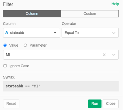
Step 2 is to create a filter where we can select a specific state, in this case Michigan (‘MI’):
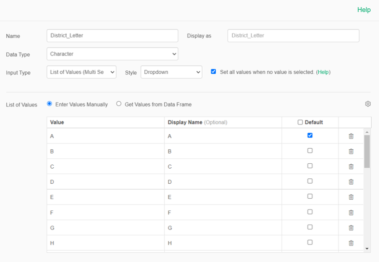
This will still leave us with hundreds of individual school districts; we need to reduce this to something more manageable and flexible. For this, we can create a parameter based on the first letter of the district name (‘A’, ‘B’, ‘C’, etc.). We build this parameter to be a multi-select, meaning we can combine two or more letters to create a useful data set for charting and analysis. Here’s what the parameter looks like:
Now that we have this ability to limit the data, we can create a nice dot plot chart showing 2022 vs. 2019 changes at the subject level (mth = Math and rla = Reading & Language Arts). Let’s filter for districts starting with the letters E, F, and G to feed our plot:

Our x-axis displays the changes in grade level for 2022 vs. 2019. Note how the data skews almost entirely to the left of zero; almost no districts in this subset showed improvement, regardless of their economic status. The average (mean) drop is 0.43 grade levels for math, and 0.50 for reading & language arts. In simple terms, students moving through 4th grade in 2022 are half a year behind their 2019 colleagues, a gap that may never be closed. We see similar patterns regardless of which districts we select. Here are the A and B districts, with drops of 0.37 and 0.46:

How about the M districts? Drops of 0.46 and 0.69 grade levels, respectively:

What about the S & T districts? How about changes of -0.56 and -0.63:

Detecting a pattern here? We are seeing an average grade level drop of roughly half a grade (0.5) among 4th graders; this is a significant drop that will likely continue to manifest itself as these students move through middle and high school, where the US already lags other developed nations:

By the way, Michigan tends to rank near the middle among US states, with a number of very high performing districts counter balanced by some truly dismal larger city districts, most notably Detroit.
Now that we have seen and analyzed the data, let’s push it to Flourish for interactive viewing. Here I have set up a dot plot similar to what we just saw in Exploratory; the filter is now set to view districts based on the first letter of their name; Allendale becomes an ‘A’, Detroit a ‘D’, Muskegon an ‘M’, and so on.
Let’s open the chart:
Blue circles represent grade level changes in mathematics (mth), while orange circles correspond to grade level changes in reading language arts (rla). The axis labels at the top of the chart show the grade level changes with gridlines for context; hover over individual points to view the details. Use the filter beneath the title to display by the first letter of a district.
As we saw with the earlier charts, there is a disturbing negative pattern regardless of the letter selected; very few values above or even near zero will be seen. Lockdowns indeed had very strong negative effects for 4th grade achievement in Michigan.
Future posts in this series will examine more SEDA data. Thanks for reading, and see you soon!