In my first two posts on this topic, the focus was on the negative outcomes inflicted by largely unnecessary school lockdowns in Michigan. We showed the impact on 4th grade test outcomes – roughly the loss of a half-grade of performance, and a full grade in Detroit, the state’s largest district. In this post I’ll take a look at the national picture, analyzing results from the 29 states with results from both 2019 and 2022. Note that many states have not submitted their 2022 results as of this writing.
Once again we’re going to use Exploratory and Flourish to analyze and visualize the data. An interesting question ultimately would be whether states with longer, stricter lockdown policies fared worse than those that reopened quickly. Our intuition suggests this is likely true, but we don’t yet have the data needed for proof. In the meantime, here’s what we see in Exploratory via a boxplot:
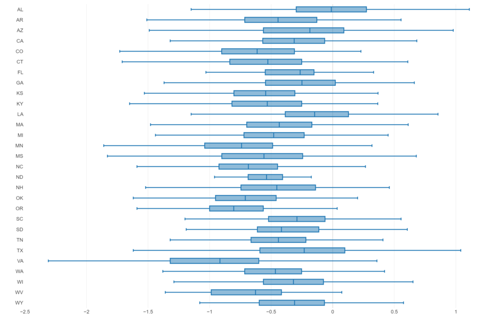
Our focus here is on the actual box portion for each state, representing the middle 50 percent of districts (25th to 75th percentiles), with the median line (50th percentile) inside the box. A handful of states immediately stand out, both above and below the general pattern. On the favorable side, although still below 0 at the median are Alabama (AL), Arizona (AZ), and Louisiana (LA). At the negative end we see Virginia (VA) with a median of nearly -1, followed by Oregon (OR), Minnesota (MN), and Oklahoma (OK). Clearly the lockdown policies had a consistently negative impact on 4th grade scores, albeit with wide variation.
Let’s move to Flourish where we can provide some interactive charts with additional granularity. We’ll first employ a box plot similar to the above, but with splits by subject and a state filter that lets us dig deeper:
Math scores suffered a bit more than rla (Reading Language Arts), although both are highly negative at the national level. Select any of the 29 states using the filter at the top of the chart to see how each one fared.
We can also view the same data using the combination of a violin plot (showing the shape of the distribution) and a beeswarm (showing the individual district changes). This combination is highly useful for determining where the bulk of the districts landed, as well as whether we see multiple bulges (perhaps poor vs. wealthy districts) in the violin shape.
Regardless of which chart you prefer, the conclusion remains the same – school lockdowns caused significant harm to 4th grade students across the country. I’ll continue adding to this series, given that it represents an important and largely unexplored downside to the nearly universal rush to lockdown driven by the political and media establishments and their masters.
As always, thanks for reading, and see you soon.