I recently rediscovered the Flourish visualization library, which I had created credentials for a few years back (I don’t even remember doing it, so it’s been awhile!). I was quite impressed with their current range of charts and other visualizations and was looking for a way to start testing the capabilities using some sort of data. Fortunately, a recent local event supplied me with exactly what I needed to do this testing. Here’s some background on the event and the available data.
A friend organizes an annual chili cook-off for charity, and has tasters score the eight different chilis entered in the event. Three judges from the food industry submit their results; there is a separate set of results for the public tasters who sample each of the eight chilis. Scores for the people’s choice range from 1 to 5 points, with additional space available for comments. The judges scoring criteria asks for specific scores for aroma, consistency, finish, and overall taste, as well as a comment section. BTW, each chili was good and the competition was intense! This small data set (I reasoned) might allow me to test Flourish before I set out to use it on larger projects this winter.
If you aren’t familiar with Flourish, it offers an amazing array of display templates. Here is a partial look at what’s available:
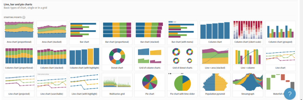
There are many more options beyond these templates, but you get the idea that this is a virtual candy shop for people like me. So I put it to the test to chart some of the cook-off results. I won’t get into the back-end data process here, but it’s actually quite simple once you discern the format needed for a given template. Here are some resulting charts, starting with a simple word cloud based on comments, which I split into terms using Exploratory:
How about a stacked bar chart showing the breakdown of scores:
Let’s look at the judges scores, first with a set of bar charts that can be filtered by criteria:
Judges scoring again, this time using a series of radar plots:
Finally, let’s look at four different ways to view the scores from Voter1 through Voter 54, to see if we can identify any trends in the scoring. First up, a simple chart showing average scores from start to finish:
Next, let’s look at an animated view of the same chart, which also provides us with a second rank chart we can toggle to see the standings at any given time:
Finally, let’s see a fun view where I converted the scores to a time format, and used a template to create a 400-meter dash:
As you can see, Flourish provides beautiful, clean graphics and the ability to view your data in many ways. I’m looking forward to tapping into it with larger data sets and using the story functionality (more to come in future posts) to develop some compelling content. Thanks for reading, and see you soon!